13 Visualising data with ggplot2
13.1 Core concepts of grammar of graphics
ggplot21516 is the package developed by Hadley Wickham, which is based on concepts laid (2005) down by Leland Wilkinson in his The Grammar of Graphics.17 Basically, grammar of graphics is a framework which follows a layered approach to describe and construct visualizations or graphics in a structured manner. Even the letters gg in ggplot2 stand for ggrammar of graphics.
Hadley Wickham, in his paper titled A Layered Grammar of Graphics18(2010)19 proposed his idea of layered grammar of graphics in detail and simultaneously put forward his idea of ggplot2 as an open source implementation framework for building graphics. Readers/Users are advised to check the paper as it describes the concept of grammar of graphics in detail. By the end of the decade the package progressed20 to one of the most used and popular packages in R.
The relationship between the components explained in both the grammars can be illustrated with the image21 in Figure 13.1. The components on the left have been put forward by Wilkinson whereas those on right were proposed by Wickham. It may be seen that TRANS has no relation in ggplot2 as its role is played by in-built features of R.
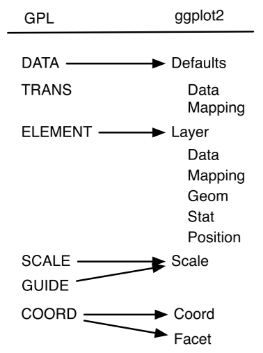
Figure 13.1: Layers in Grammar of Graphics mapped in GGPLOT2
Thus, to build a graphic having one or more dimensions, from a given data, we use seven major components -
-
Data: Unarguably, a graphic/visualisation should start with a
data. It is also the first argument in most important function in
the package i.e.
ggplot(data =). -
Aesthetics: or
aes()in short, provide a mapping of various data dimensions to axes so as to provide positions to various data points in the output plot/graphic. -
Geometries: or
geomsfor short, are used to provide the geometries so that data points may take a concrete shape on the visualisation. For e.g. the data points should be depicted as bars or scatter points or else are decided by the providedgeoms. -
Statistics: or
statfor short, provides the statistics to show in the visualisation like measures of central tendency, etc. - Scale: This component is used to decide whether any dimension needs some scaling like logarithmic transformation, etc.
- Coordinate System: Though most of the time Cartesian coordinate system is used, yet there are times when polar coordinate system (e.g. pie chart) or spherical coordinate system (e.g. geographical maps) are used.
- Facets: Used when based on certain dimension, the plot is divided into further sub-plots.
Out of the afore-mentioned components, first three (data, aesthetics and geometries) are to be explicitly provided and thus can be understood as mandatory components. Whilst these three components are mandatorily provided, it is not that others are not mandatory. It is just that other components have their defaults (e.g. default coordinate system is Cartesian coordinate system). Let us dive into these three essential components and build a plot using these.
13.2 Building a basic plot using key components
We will use mtcars data-sets, which is a default dataset in the package, to learn the concepts. Let us see what happens when data is provided to ggplot function-

Figure 13.2: Data provided to ggplot2
In Figure 13.2 we can see that a blank chart/plot space has been created as our data mtcars has now mapped with ggplot2. Now, let us provide aesthetic mappings to this using function aes(), through the argument mapping in ggplot2 function itself.
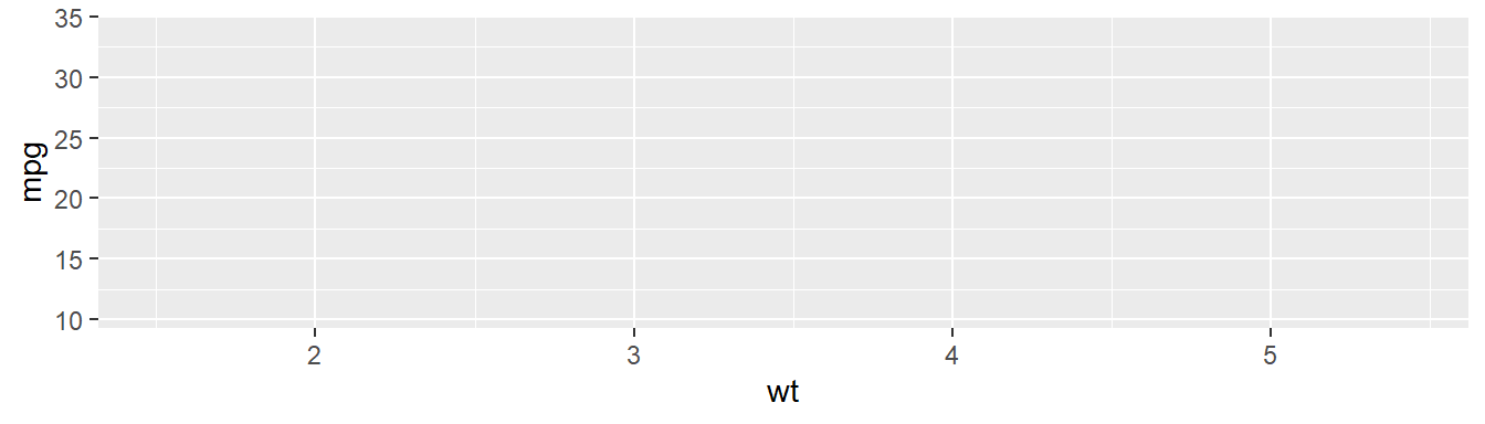
Figure 13.3: Data and mapping provided to ggplot2
In Figure 13.3, we may now notice that apart from creating a blank space for plot, the two dimensions provided, i.e. wt and mpg have been mapped with x and y axes respectively. Since no geometry has been provided, the plot area is still blank. Now we will provide geometry to our dimension say point. To do this we will use another family of functions i.e. geom_* (geom_point() in this case specifically).
ggplot(data = mtcars, mapping = aes(x = wt, y = mpg)) +
  geom_point()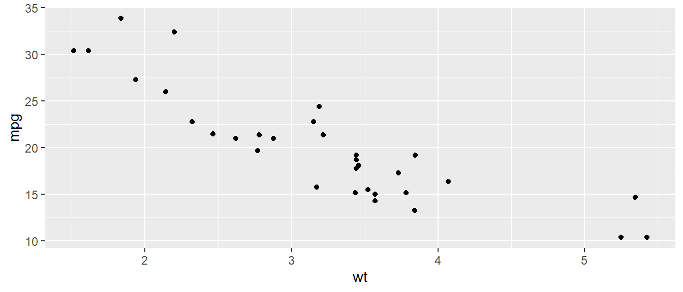
Figure 13.4: Data plotted as points in a scatterplot
In Figure 13.4 we may now notice that data has been plotted
as points (due to the geometry we used geom_point) as soon as we added
another layer of function ggplot() using a + sign in the earlier
code. Using the code above, we have actually plotted the relationship
between weight of the vehicle (wt) and mileage in miles per gallon
(mpg) of the vehicles available in mpg dataset.
We could have plotted the data as box-plot if we had used another
geometry say geom_boxplot here. Refer Figure 13.5.
ggplot(data = mtcars, mapping = aes(y = wt)) +
  geom_boxplot()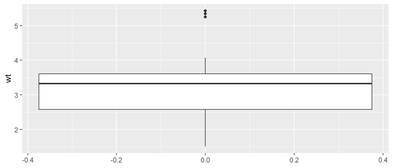
Figure 13.5: Data plotted as boxplot
That’s the basic architecture for construction of a plot in this
package. Up to this point it may be noted that we have provided data
and aesthetics as argument to function ggplot and for geometry we
have used another function geom_* and added it to above components
using a plus + sign. In the above code(s) it may also be noted that
data and mapping are the first two arguments of function ggplot;
x and y are the default first two arguments of function aes so we
may draw the same plot in Figure 13.4 using the following
code wherein we haven’t used these as named arguments. We will follow
the same convention in subsequent sections.
ggplot(mtcars, aes(wt, mpg)) +
  geom_point()
Now lets discuss more on aesthetics and geometries and using these
to build the desired plots, before moving on to other components of plot
in the package.
13.3 Other Aesthetic attributes (color, shape, size, etc.)
In previous section of this chapter we mapped the attributes in data
using the position in coordinate system (x and/or y in Cartesian
coordinate system). We can, however, map other variables in the data to
the plot using aesthetic attributes like shape, size, color,
alpha (transparency), etc., as shown in the image in Figure
13.6.

Figure 13.6: Some Common Aesthetic mappings. Image Source: Claus Wilke’s book on Fundamentals of Data Visualization
These aesthetics may be divided broadly into two categories -
- aesthetics those can be mapped with
continuousdata variable(s); and - aesthetics those can be mapped with
discreteor categorical data variables.
For example, position (coordinates in a coordinate system), size,
color, linewidth can represent continuous data; but shape,
linetype etc. aesthetics can be mapped with discrete data. Numerical
data which can be used to represent both continuous and discrete
data (we will see example shortly) if mapped to an aesthetic will by
default represent continuous data and thus, need to be converted to a
discrete data type (factor, in most of the cases will suffice) before
mapping to an aesthetic representing discrete data.
Some commonly used aesthetics are -
-
shape= Display a point withgeom_point()as a dot, star, triangle, or square -
fill= The interior color (e.g. of a bar or box-plot) -
color= The exterior line of abar,boxplot, etc., or the point color if usinggeom_point() -
size= Size (e.g. line thickness, point size) -
alpha= Transparency (1 = opaque,0 = invisible) -
binwidth= Width of histogram bins -
width= Width of “bar plot” columns -
linetype= Line type (e.g. solid, dashed, dotted)
13.3.1 Color, the most important aesthetic
Data elements can be colored in a data visualisation using aesthetic
named color (Alternative British spelling colour will also work in
exactly same way). We can use color in a plot/visualisation primarily
for three purposes-
- highlight specific or all values.
- grouping the data points i.e. using color to distinguish data elements from each other.
- mapping a variable, i.e. using color to represent different data elements.
To understand the use cases, let us fill the color of all points in
Figure @(fig:rgg3) with say, "red" color. To do this, we can provide
the value of color aesthetic directly inside the geom_* function
(Figure 13.7).
ggplot(mtcars, aes(wt, mpg)) +
  geom_point(color='red')
Figure 13.7: Highlighting all data points with a static color
As the argument color='red' was mentioned inside the geom_point()
function, it turned every point to red (i.e. with a static color) in
Figure 13.7. But if the requirement was to highlight specific
points in the plot, we have to use the color inside aes function. Or
in other words, we have to use color aesthetics to visualise the data.
So let us color the data points in Figure 13.7 using the
variable cyl (number of cylinders in the vehicle), so that the
scatter-points are colored on the basis of number of cylinders instead.
ggplot(mtcars, aes(wt, mpg)) +
  geom_point(aes(color=cyl))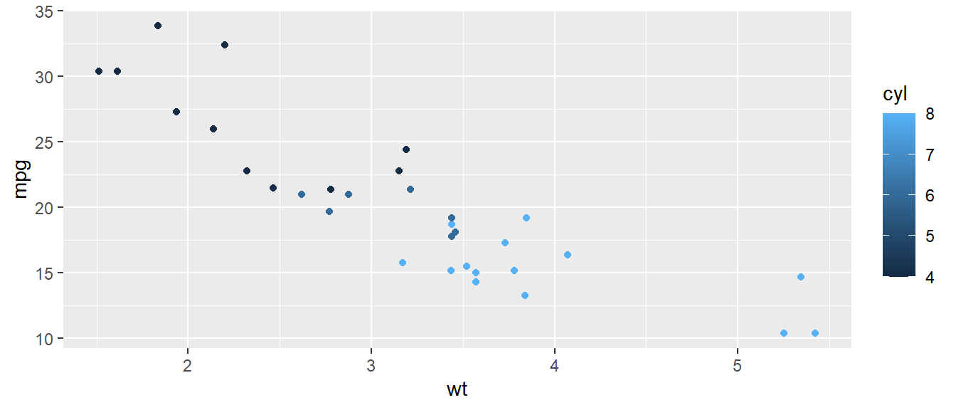
Figure 13.8: Mapping a numeric variable with color aesthetic
We may notice in Figure 13.8 that scatter-points are now
colored on the basis of number of cylinders in the cars. Simultaneously,
a color scale has been produced as a legend. Since the cyl column was
a numeric column, and we mapped that with a continuous type aesthetic
color, it mapped the continuous variable with the aesthetic by default.
Now in this case, though the cyl is having numerical values, the plot
will be more meaningful if the corresponding discrete variable is
mapped with color aesthetic. So we can convert it into a factor type
variable, on the fly.
ggplot(mtcars, aes(wt, mpg)) +
  geom_point(aes(color=as.factor(cyl)))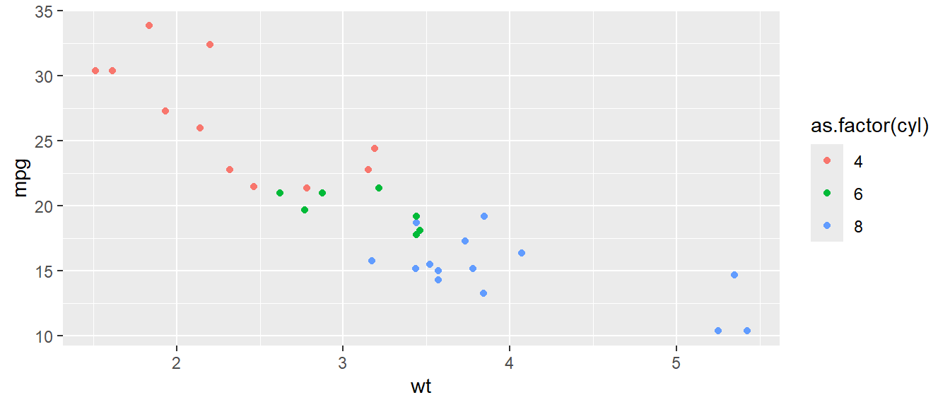
Figure 13.9: Mapping a discrete variable with color aesthetic
In Figure 13.9 we may see that the points have been grouped
using different color of each of the group. Readers may also that the
color aesthetic was provided through aes() function in the second
layer which was wrapped in geom_point() function. The aesthetic could
have been wrapped in ggplot() layer also. So basically the following
code will also produce exactly the same chart-
ggplot(mtcars, aes(wt, mpg, color = as.factor(cyl))) +
  geom_point()
So is there any difference between the two? Yes, basically aesthetics if
provided under the geoms, will override those aesthetics which are
already provided under ggplot function. To understand the difference,
see the result of following code in Figure 13.10.
ggplot(mtcars, aes(wt, mpg, color = as.factor(cyl))) +
  geom_point(color='red')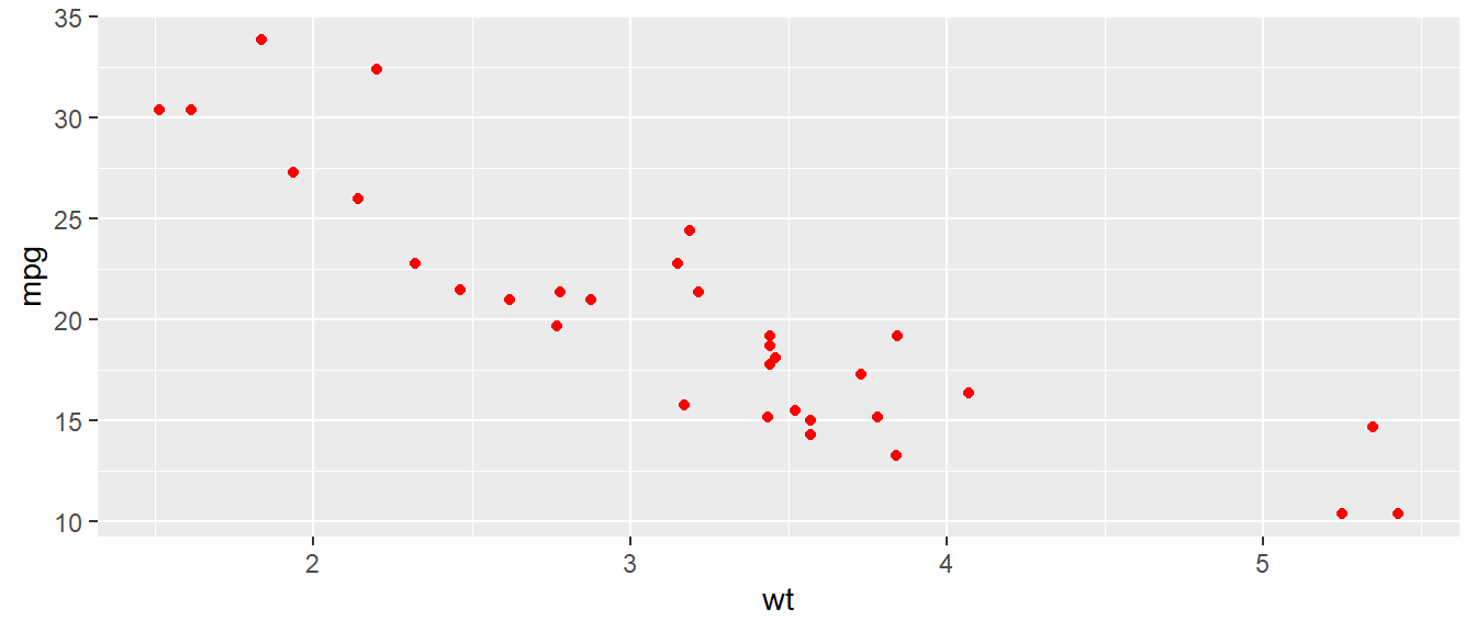
Figure 13.10: Over-riding aesthetics
As the third use-case, i.e. using color to describe the variable, let us
analyse the mean mileage of cars for each group of cars for (i) number
of cylinders cyl and (ii) number of carburetors carb. A good
visualisation to plot the values will be heat-map (sometimes also
called as highlight table). We will generate a grouped summary before
proceeding, which can be understood using the concepts explained in
chapter related to data manipulation in dplyr i.e. Chapter
14.
To draw the rectangular boxes in heat-map we will use another geometry
namely geom_tile() and map two categorical variables with x and y
coordinates in the Cartesian system. To fill the color values on the
basis of variable mpg we will use fill aesthetic instead of color
(we will understand the difference between fill and color aesthetics
shortly).
mtcars |>
  summarise(mpg = mean(mpg, na.rm = TRUE),
            .by = c(cyl, carb)) |>
  ggplot() +
  geom_tile(aes(x = cyl, y = carb, fill = mpg))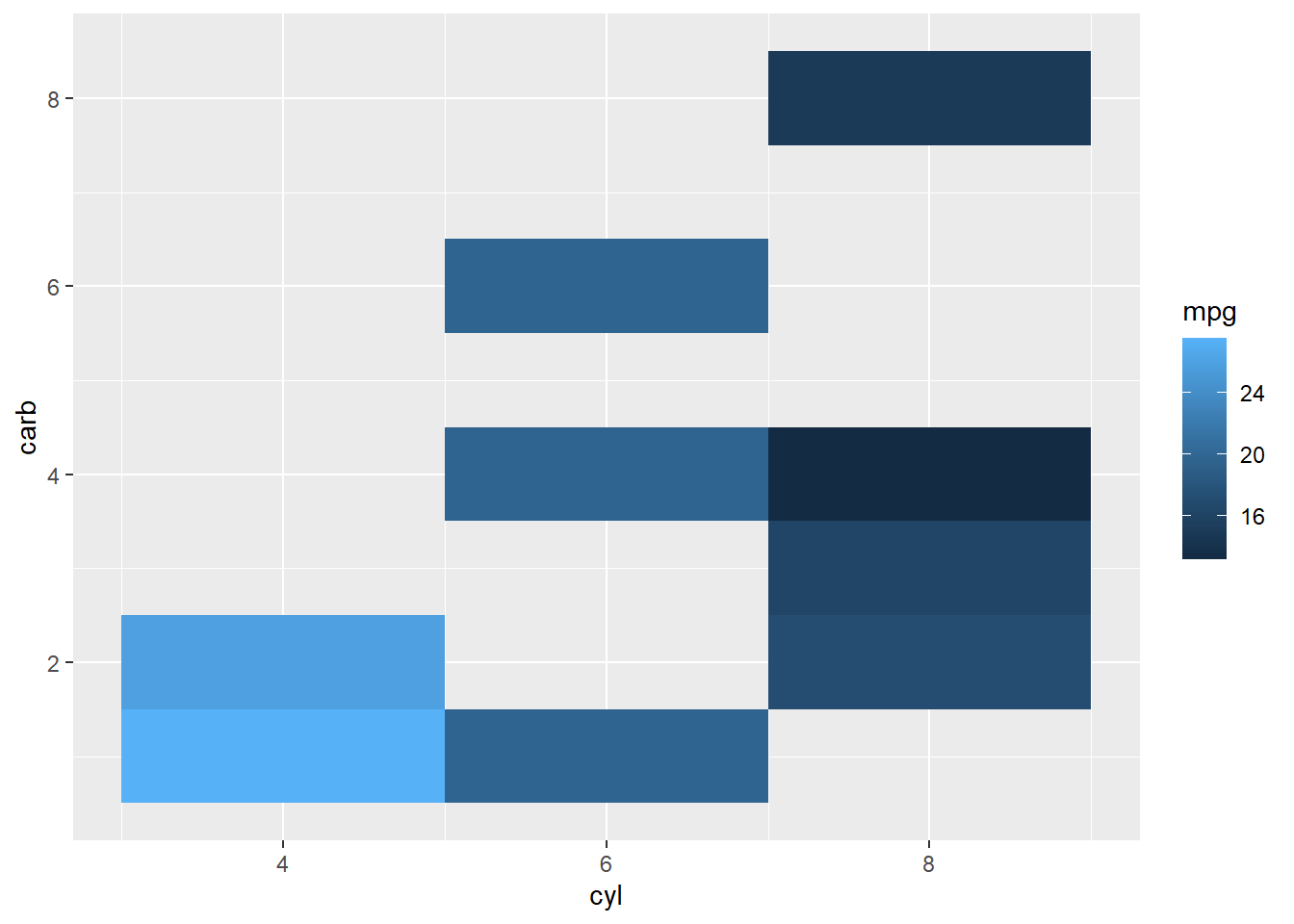
Figure 13.11: using color to plot variable directly
Referring plot in Figure 13.11 we may see that cars with 4 cylinders and 1 carburetor have highest mileage.
So up to now, we have seen that to map color dynamically with a
variable, we have pass this aesthetic inside aes function; and
otherwise if we intend to use color only as a static value, we may pass
it outside the aes i.e. directly in the corresponding geom function.
Package ggplot2 recognises most of the color names and we have discussed
more about colors in Appendix A. But what if we pass a
static color value to color aesthetic inside the aes function? Let
us check ourselves.
ggplot(mtcars, aes(wt, mpg)) +
  geom_point(aes(color='blue'))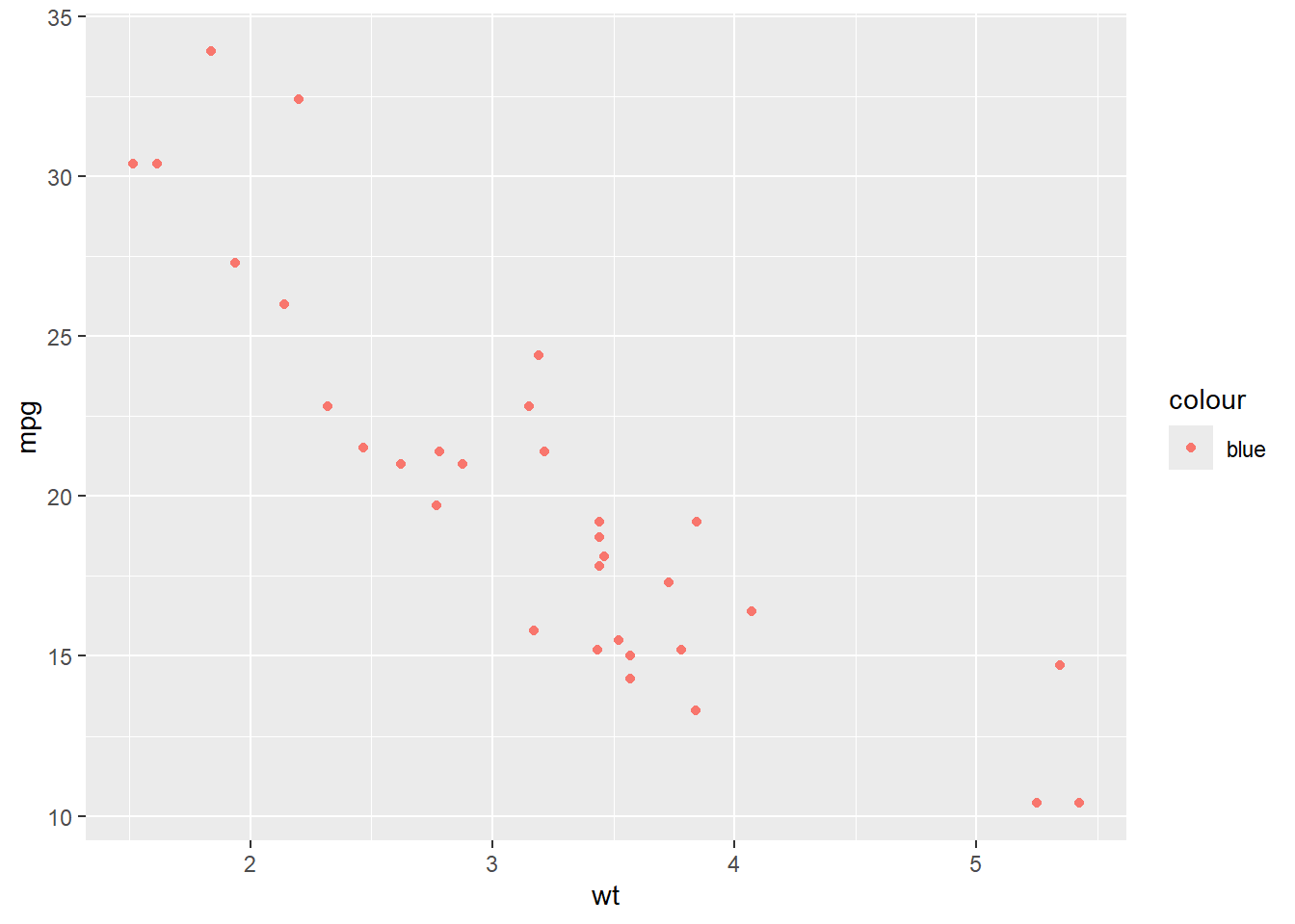
Figure 13.12: Mapping Static color inside aes
Interesting! GGPLOT2 has not only mapped a dummy variable called
'blue' with color of points, but also created a legend. More
interestingly the color is not what we wanted. Actually, what happened
was, that when we mapped color aesthetic inside aes(), ggplot2 created
a new variable on the fly, and then mapped it with the aesthetic and
thus producing a legend for the newly created variable.
13.3.2 Color Vs. Fill
Till now we use used color aesthetic with the point geom (Figure
13.9) and fill aesthetic in tile geom (Figure
13.11) to map colors to the variables. Why did we use
different aesthetics? Typically, the color aesthetic changes the
outline of a geom and the fill aesthetic changes the inside.
geom_point() was an exception, we used color (not fill) for the
point color. Actually, it was not an exception too. The reason was that
the default point shape used by geom_point() was shape = 19: a solid
circle.
We can see the subtle difference if we override the default shape in
figure 13.9 with shape = 21: a circle that allows us to use
both fill for the inside and color for the outline. (Figures
13.13.)
theme_set(theme_bw())

ggplot(mtcars, aes(wt, mpg)) +
  geom_point(aes(color=as.factor(cyl)), shape = 21, size = 4) +
  ggtitle("Using color aesthetic")

ggplot(mtcars, aes(wt, mpg)) +
  geom_point(aes(fill=as.factor(cyl)), shape = 21, size = 4) +
  ggtitle("Using fill aesthetic")
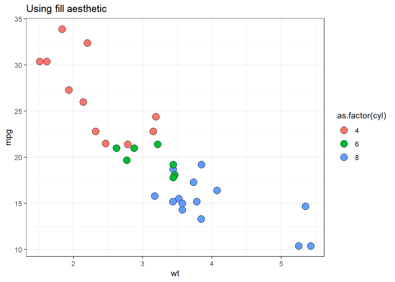
Figure 13.13: Color Vs. Fill aesthetics
13.3.3 Transparency through alpha
In ggplot2, there is one more aesthetic which is used to change color
of the geometries, alpha which is used to control the transparency of
the elements in a plot. By adjusting the alpha value, which ranges
from 0 (completely transparent) to 1 (fully opaque), we can manage the
visibility and layering of overlapping elements. This is particularly
useful when dealing with dense data, as it helps to reduce over-plotting
and allows for better visualization of distributions and relationships.
Usually, it is used to map a continuous variable with it. Example-
ggplot(mtcars, aes(x = wt, y = mpg)) +
geom_point(aes(alpha = cyl), size = 4) 
Figure 13.14: Setting transparency with the number of cylinders
We may see in figure 13.14 that points transparency nor
varies according to the number of cylinders i.e. cyl variable in the
data. Similar to other aesthetics we may pass static value between 0 to
1 to alpha for setting the transparency of geometries as desired.
13.3.4 Shape Aesthetic
In figure 13.13, we already saw the shape aesthetic to change
the shape of points from solid color to hollow color. Actually, in
ggplot2, the shape aesthetic is used to differentiate points in a
plot by assigning different symbols to them. Moreover, as we have
already discussed, this aesthetic should either be mapped with a
discrete variable; or if using shape from pre-existing shapes in the
package (see ?points). ggplot2 supports a variety of shapes, such as
circles, triangles, squares, and more, each represented by a unique
integer or character.
For instance, when plotting data with a categorical variable, we can map
this variable to the shape aesthetic to visually separate the groups.
However, it’s important to note that shapes can be less effective for
groups with many categories, as the distinctiveness of each shape may
diminish.
So in the above plots, we may map cyl variable to shape instead, by
converting it into factor variable.
ggplot(mtcars, aes(wt, mpg)) +
  geom_point(aes(shape=as.factor(cyl)), size = 3)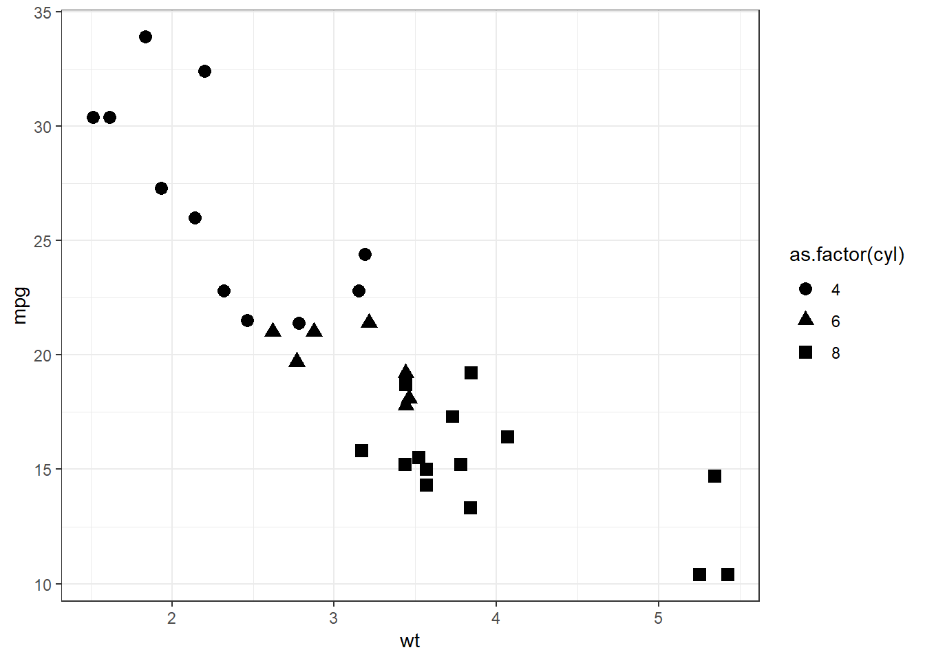
Figure 13.15: Mapping shape aesthetic
In above we may notice that different shapes have been used for 4, 6 and 8 cylinder vehicles.
A few shapes available in shape aesthetics, with fill aesthetic
shown in orange' andcolor` aesthetic shown in ‘blue’ color in
figure 13.16.
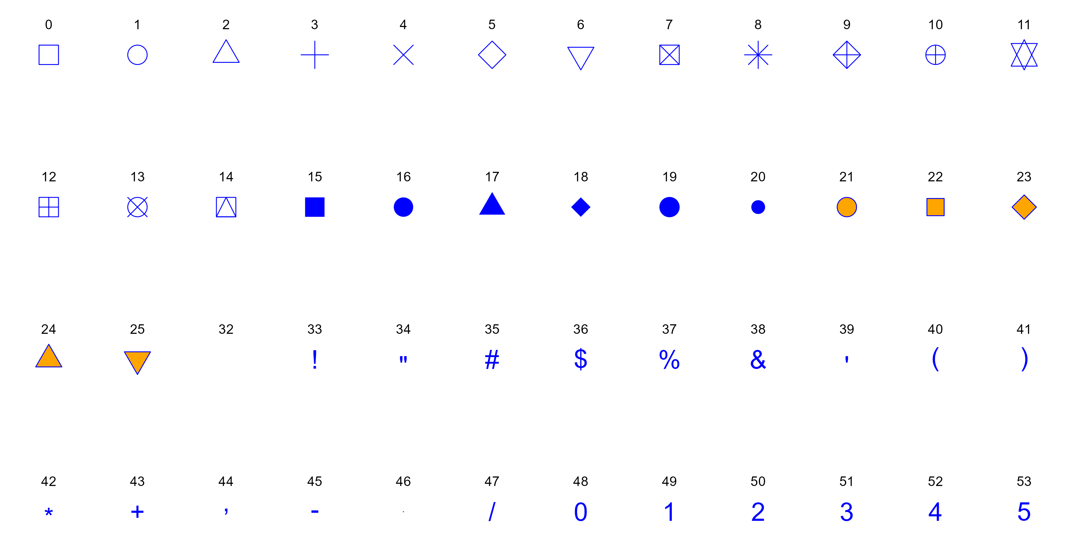
Figure 13.16: Some Shapes available in GGplot
13.3.5 Size Aesthetic
As we have already seen that the size aesthetic controls the size of
plot elements or geometries, such as points in a scatter plot. By
mapping a continuous or discrete variable to size, we can represent
additional dimensions of our data, making the plot more informative.
For example, in a scatter plot of car weight versus fuel efficiency, we
might use the size aesthetic to represent the horsepower of each car,
where larger points indicate more powerful cars.
ggplot(mtcars, aes(wt, mpg)) +
  geom_point(aes(size=hp))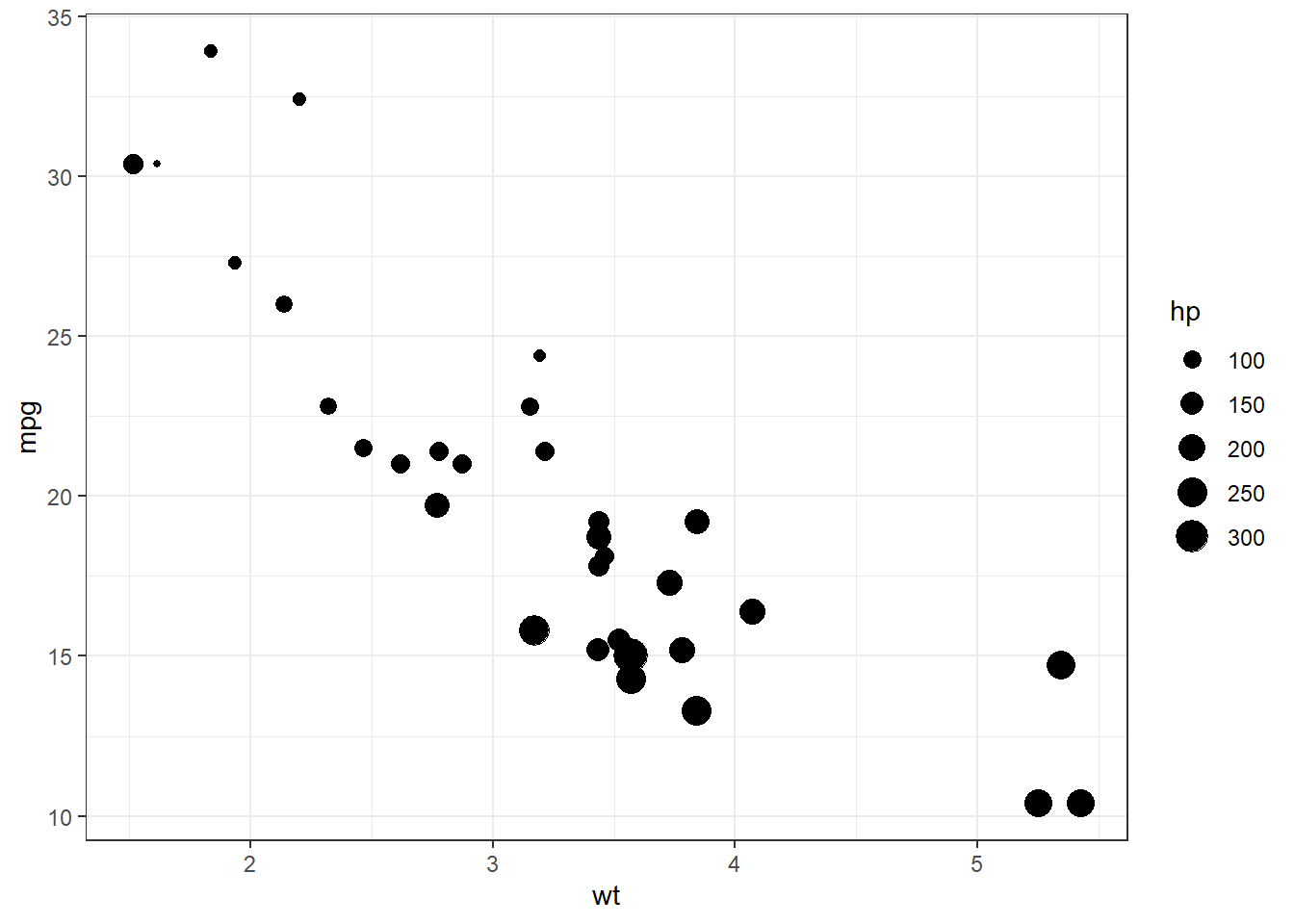
Figure 13.17: Mapping size aesthetic
In figure 13.17 we may see that a visual layer has been added
that helps to identify relationships and patterns across multiple
variables simultaneously. However, it’s essential to use the size
aesthetic judiciously, as overly large or small elements can distort the
readability of the plot.
13.3.6 Using multiple aesthetics simultaneously
Multiple aesthetics can also be mapped simultaneously, as per requirement. See this example-
ggplot(mtcars,
       aes(
         x = wt,
         y = mpg,
         shape = as.factor(cyl),
         color = as.factor(gear),
         alpha = wt,
         size = hp
       )) +
  geom_point()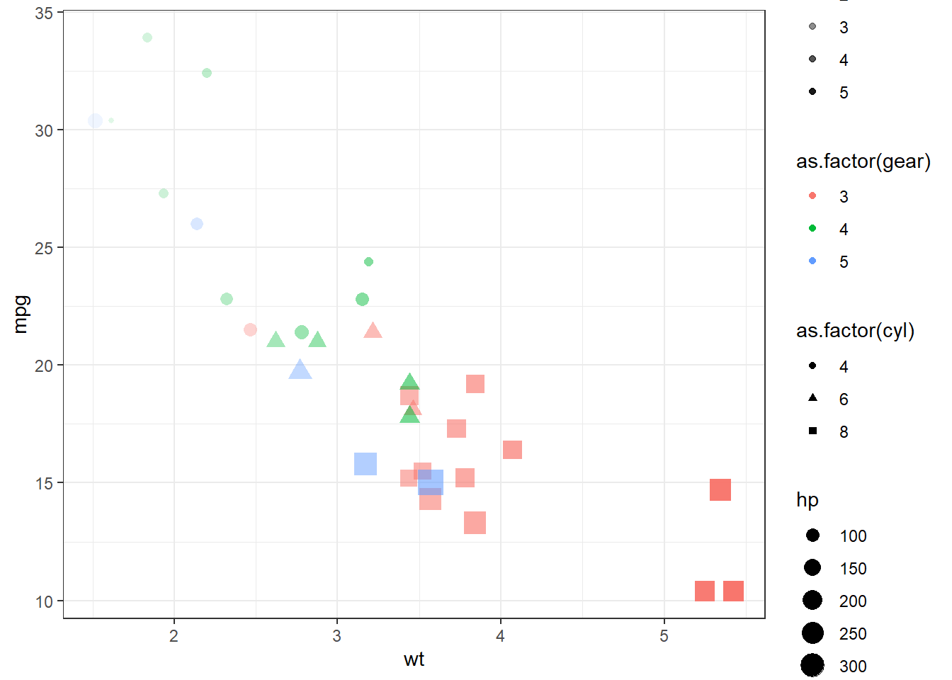
Figure 13.18: Using multiple aesthetics
We will learn about some other aesthetics like binwidth, linetype,
width, etc., in the next section 13.4 when we will learn about
the use of other geometries.
13.4 More on Geoms
In previous section we have seen that as soon as we passed a geom_*
function/layer to data & aesthetics layers, the chart/graph was
constructed. Actually, geom_point() function, in the background added
three more layers i.e. stat, geom and position, because geom_*
are actually shortcuts, which add these three layers. So in our example,
ggplot(mtcars, aes(wt, mpg)) + geom_point() is actually equivalent to
-
ggplot() +
  layer(
    data = mtcars,
    mapping = aes(wt, mpg),
    geom = "point",
    stat = "identity",
    position = "identity"
  )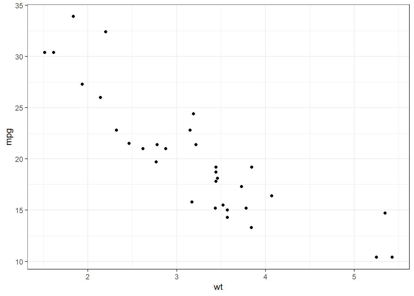
Figure 13.19: Components of GGPLOT2
Some common geoms are listed below:
- Histograms -
geom_histogram() - Bar charts -
geom_bar()orgeom_col() - Box plots -
geom_boxplot() - Points (e.g. scatter plots) -
geom_point() - Line graphs -
geom_line()orgeom_path() - Trend lines -
geom_smooth() - Heat-map -
geom_tile() - Label charts using
geom_text()and/orgeom_label()
Of these, we have already seen examples of geom_point, geom_boxplot
and geom_tile. Let us discuss some other geoms in a bit detail.
13.4.1 Univariate Bar Charts through geom_bar()
Bar charts though form simplest of the visualisations but can be deceptive if we try to build these without understanding the mechanics behind the bars, literally :). Bar charts can both be univariate and bivariate. Even multivariate data can be visualised through bar charts.
Simplest of bar charts can be a plot showing distribution of a categorical variable in the data. In other words, the number of data points available per category of the variable. Example - How many cars with different cylinder count are available in the data.
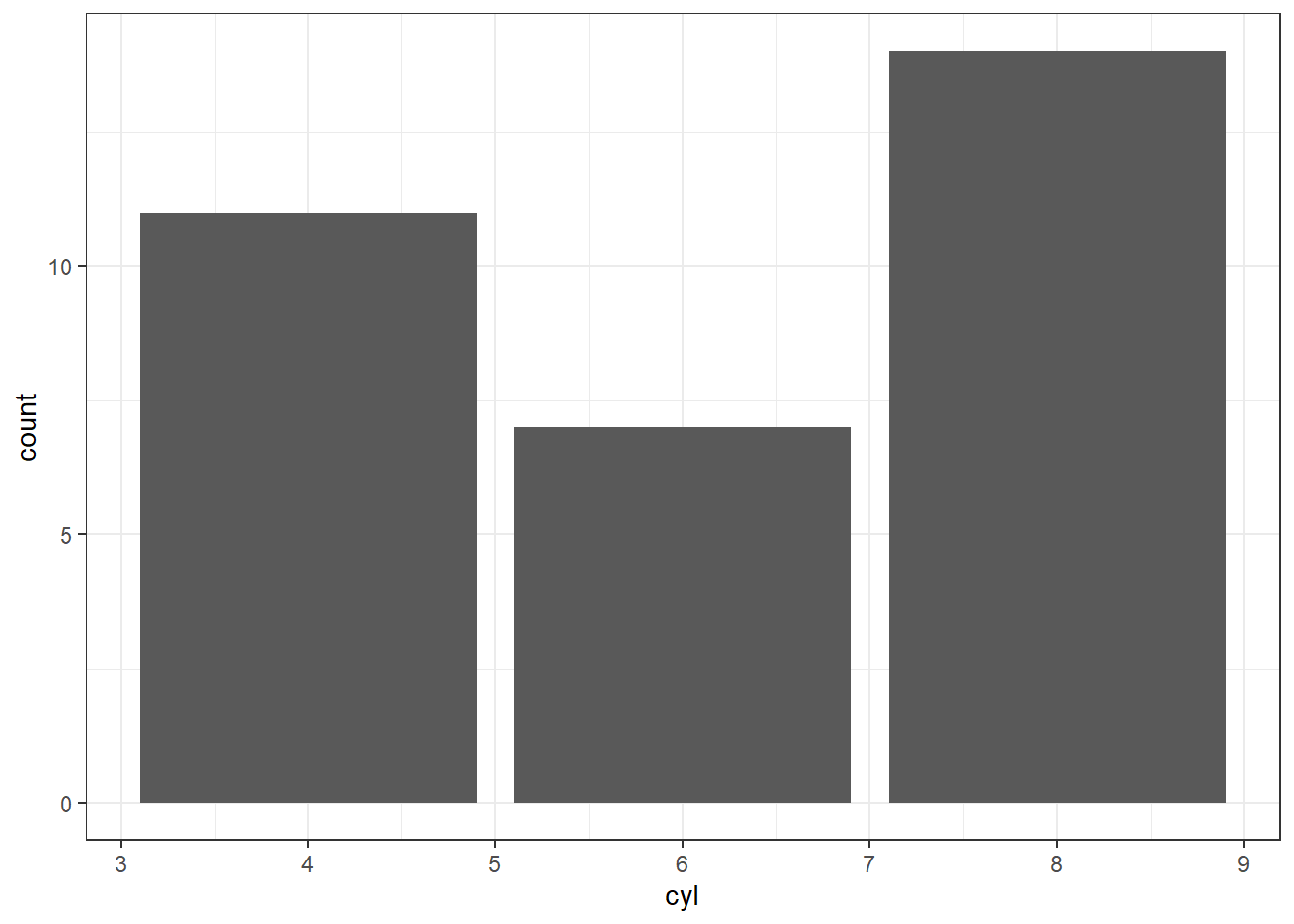
Figure 13.20: Univariate Bar Chart
In figure 13.20 we may see the numbers of cars available per
category (of cylinders therein). As we have used numerical variable on
the x-axis, a numerical scale has been shown. Also notice that our data
was not summarised and ggplot2 itself aggregated it on the basis of
variable passed in aesthetics (position) by applying count summary
function. This can be confirmed from the label on y axis.
Readers are advised to note the change in x-axis as soon as the variable is converted to a categorical variable, by executing the code-
ggplot(mtcars, aes(as.factor(cyl))) +
  geom_bar()
That was about aggregating data by itself in bar-plot using count
function. But sometimes, other aggregation methods may be required. That
can be done if we understand the mechanics behind the code. Actually
aes(cyl) was a shortcut to aes(x = cyl, y = after_stat(count)) where
count is a special variable representing the counts in each of the
category present in the variable.
So now, let us calculate proportions instead of count (frequency) of the
categories available in the variable. For a change, now let us use
another dataset mpg which comes by default with ggplot2 package. We
will analyse proportion of vehicles under each class (which is a
categorical variable).
ggplot(mpg, aes(class, y = after_stat(count/sum(count)))) +
  geom_bar()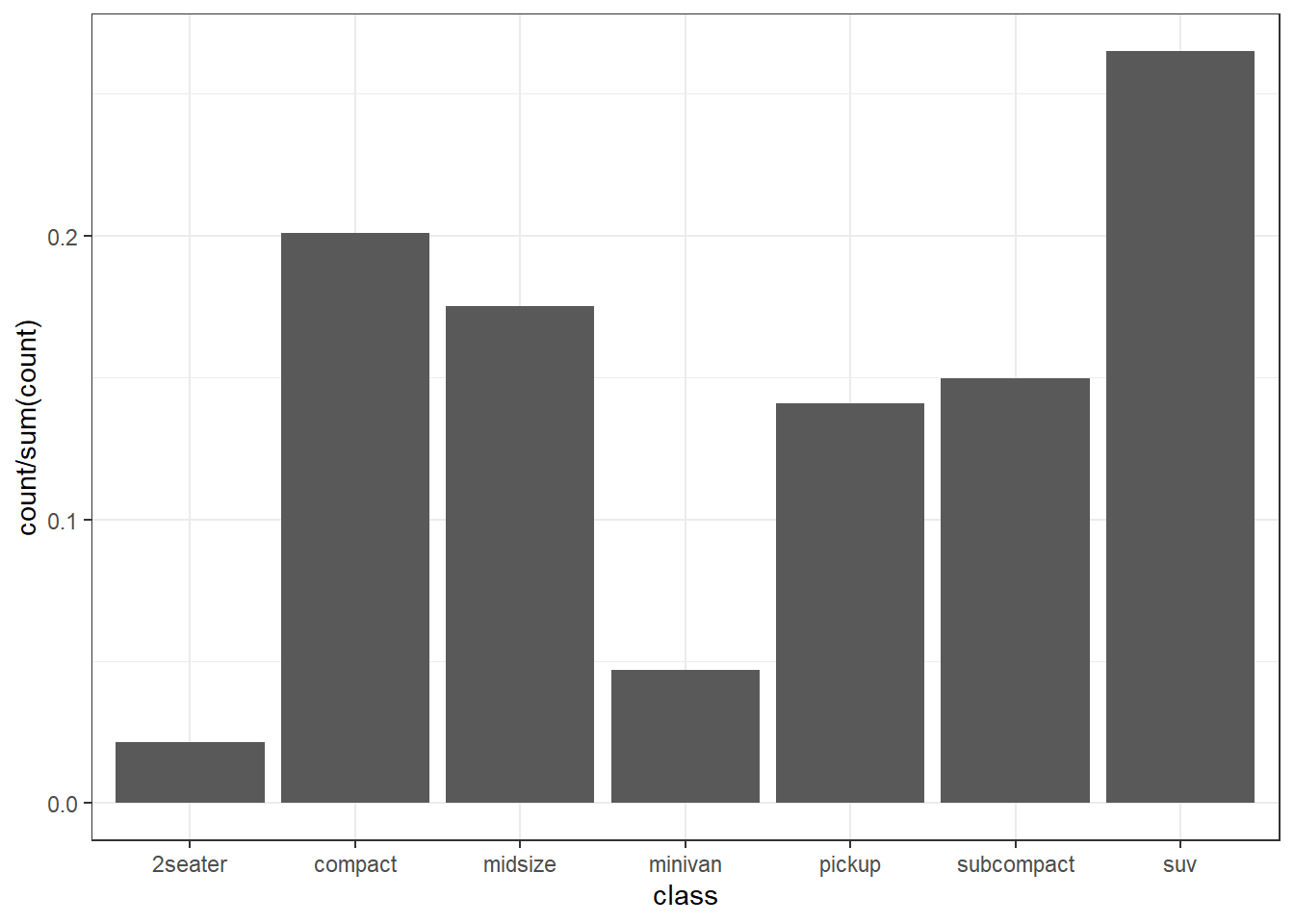
Figure 13.21: Univariate Bar Chart representing proportions
In figure 13.21 we may see that now the proportions have been plotted (notice y axis).
13.4.2 Bivariate Bar Charts through geom_bar()
We have learn how the geom_bar() carries out a summarisation on
un-aggregated or granular data and draws plots for us. To tweak the
summary function, as per our requirement, we used y position
aesthetic. But in same granular data, we may sometimes require to
perform an aggregation on another variable.
As an example let us see the mean city mileage cty for every class
of car in mpg data-set. To achieve this, we will another aesthetics
stat with special value "summary_bin". Moreover, the stat
aesthetics also requires a fun statistic which is mean in our case.
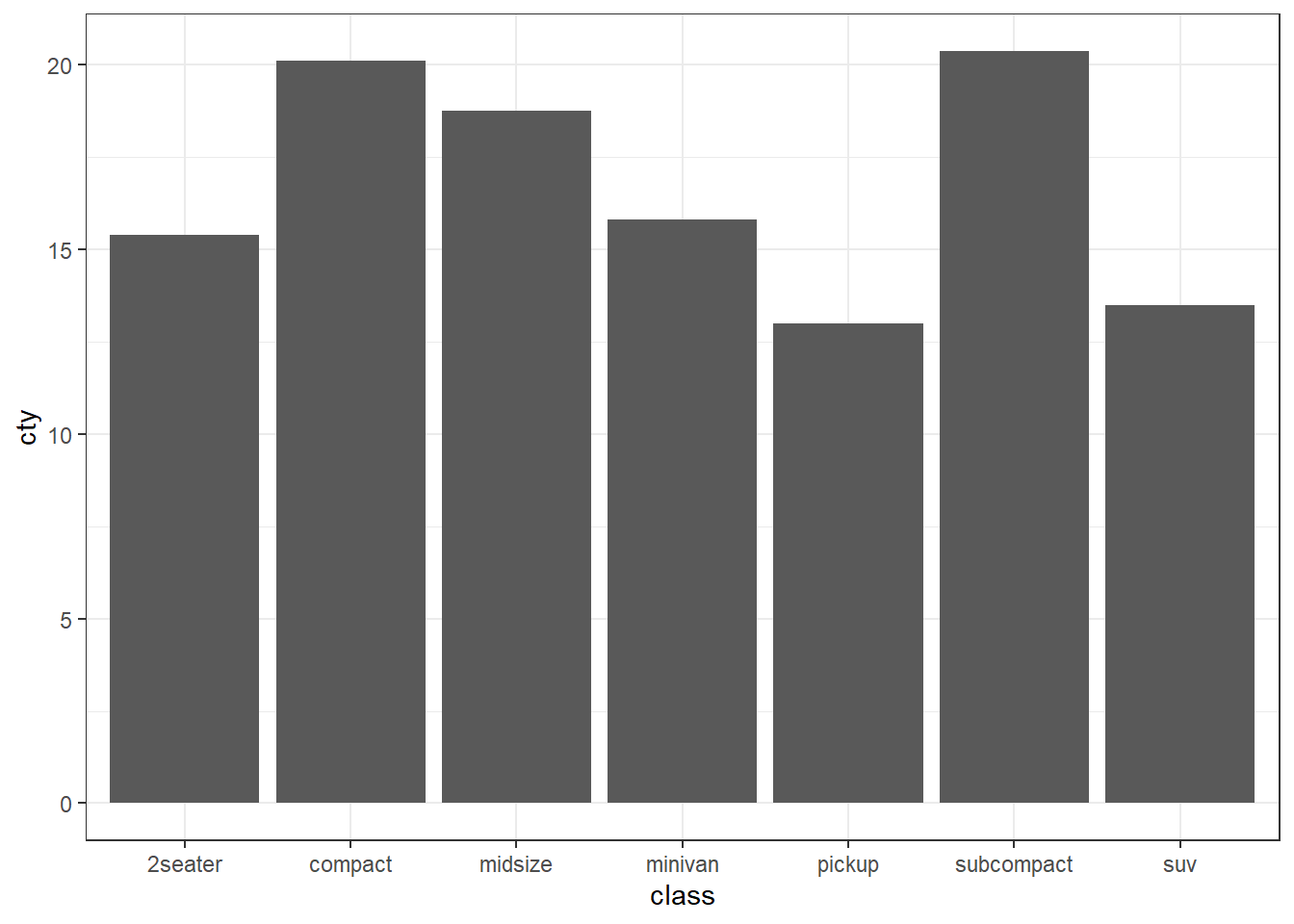
Figure 13.22: Bivariate Bar Chart representing mean milaege per class of car
In figure 13.22 we can see that subcompact class of cars
has highest mean mileage in city.
In these two sections, we have learnt to draw plots using un-aggregated
data. However, we can also plot pre-aggregated data to bar-plots using
geom_bar. So let us draw the same plot as in figure 13.22,
but this time aggregating data by ourselves, beforehand. The trick is to
use stat = "identity" aesthetics in a geom_bar() layer. We will see
what this aesthetic is doing actually in a short-while. For a change,
this time let’s draw the plot with x and y axes flipped.
aggregated_mpg <- mpg |>
  summarise(mean_cty = mean(cty),
            .by = class)

ggplot(aggregated_mpg, aes(x = mean_cty, y = class)) +
  geom_bar(stat = "identity")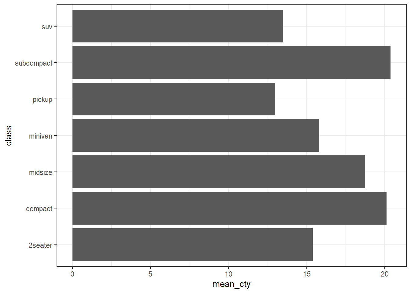
Figure 13.23: Bivariate Bar Chart representing mean milaege per class of car
In figure 13.23 we can see the desired have been generated.
Readers may try the above-mentioned code by removing stat - "identity"
from the geom_bar().
Now, as promised we will discuss what stat aesthetic does. While
generating summary in a bivariate chart we used stat = "summary_bin"
which created summary using fun of un-aggregated data. Whereas
stat = "identity" tells ggplot2 that data is either already aggregated
or there is only value of y per category of x variable. So are there
other stat aesthetics available for us? The answer is yes. However,
readers are advised to plot bar charts on aggregated data using
geom_col which has been discussed in subsequent sections, instead of
trying the complex aggregations within ggplot2 as it gets trickier from
here.
13.4.3 Stacked bar charts through geom_bar
In section 13.3, we learnt that we can plot other variables in
the two-dimensional plots using aesthetic attributes like color, size,
etc. As size of the bar, in a bar chart is already mapped to a variable,
most suitable aesthetic to be mapped to another variable is fill or
color.
Let us aggregate the cars (count) on the basis of class again. But
let’s map fill to fuel type fl variable.
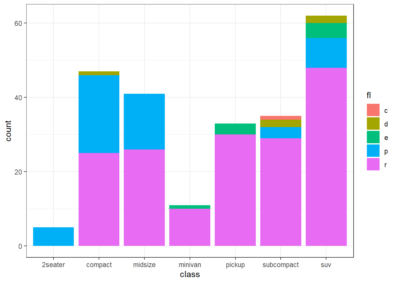
Figure 13.24: Color Stacked bar chart
In figure 13.24 we achieved our desired results simply by
mapping fill to our additional variable. Actually, this was possible
due to default value of position aesthetic in geom_bar() layer
"stack" matches our requirement. By default, multiple bars occupying
the same x position will be stacked atop one another by
position_stack().
A useful argument reverse in this position_stack() is also helpful
in reversing the order of fill values. E.g. if the above plot is drawn
at y-axis instead.
ggplot(mpg, aes(y = class, fill = fl)) +
  geom_bar(position = position_stack(reverse = TRUE)) +
  theme(legend.position = "top")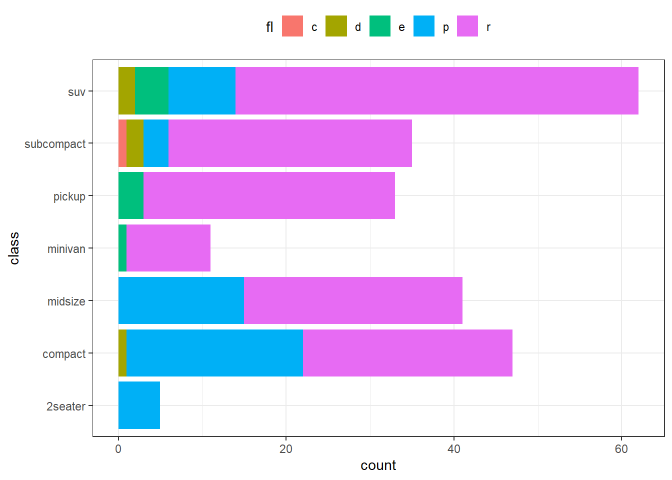
Figure 13.25: Color Stacked bar chart on Y axis
In figure 13.25 we can see that legend values now align with the values represented in bar chart.
To use the bars, side by side, in a plot we can use another position
stat function position_dodge(). Redrawing the same plot above with
bars side by side-
ggplot(mpg, aes(x = class, fill = fl)) +
  geom_bar(position = position_dodge()) +
  theme(legend.position = "top")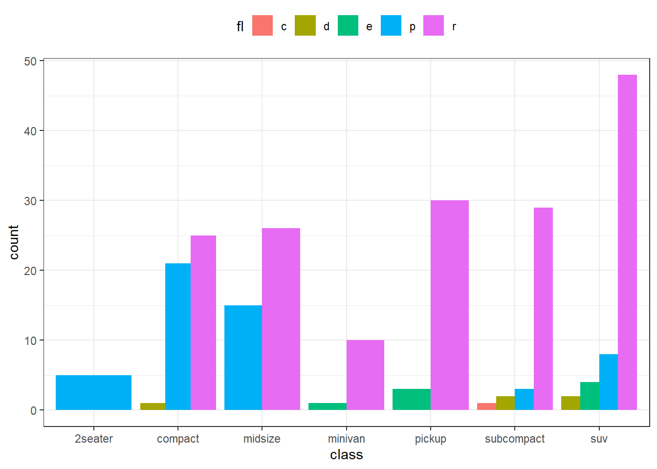
Figure 13.26: Dodged Bar Chart
In figure 13.26 we may see that separate bar for each fill
axis have now been drawn. The bars’ widths have been preserved as the
default parameter for preserve inside position_dodge() is total.
We may have to change it to "single" if we want bars of equal width
irrespective of the fact that whether each fill category is available
for each of the x value. Refer figure 13.27 wherein bars’
widths are equal.
ggplot(mpg, aes(x = class, fill = fl)) +
  geom_bar(position = position_dodge(preserve = "single")) +
  theme(legend.position = "top")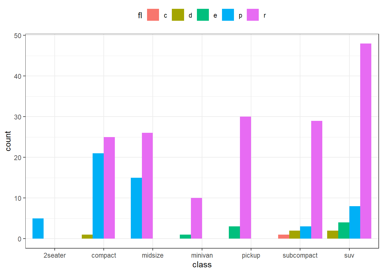
Figure 13.27: Dodged Bar Chart with equal bar widths
Similar to position_dodge there is another position_dodge2()
function which works better for bar charts. We may tweak the padding
between bars (Refer figure 13.28).
ggplot(mpg, aes(x = class, fill = fl)) +
  geom_bar(position = position_dodge2(preserve = "single", padding = 0.2)) +
  theme(legend.position = "top")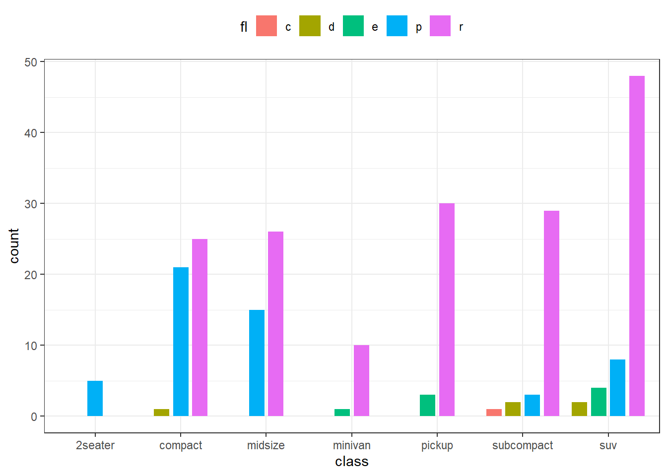
Figure 13.28: Dodged Bar Chart with padding between bars
Finally, there is one more position namely position_fill() which
stacks bars and standardises each stack to have constant height. Refer
figure 13.29.
ggplot(mpg, aes(x = class, fill = fl)) +
  geom_bar(position = position_fill()) +
  theme(legend.position = "top")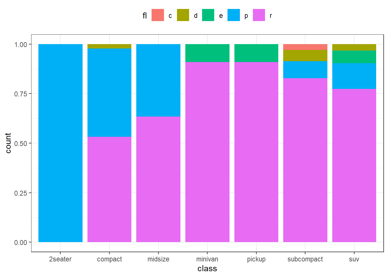
Figure 13.29: 100% stacked bar chart
13.4.4 Bar Charts through geom_col()
As stated earlier, plotting bar charts on tedious aggregations through
ggplot2 gets trickier, it is always advisable to plot bar charts through
geom_col() in such cases after aggregating thee data ourselves. Since
the difference between geom_bar and geom_col is that former uses by
default: it counts the number of cases at each x position. On the other
hand, latter uses stat = “identity” by default. So to draw the plot as
in figure 13.23 through geom_col() we may not have to use
stat explicitly. (Refer figure 13.30.)
aggregated_mpg <- mpg |>
  summarise(mean_cty = mean(cty),
            .by = class)

ggplot(aggregated_mpg, aes(x = mean_cty, y = class)) +
  geom_col()
Figure 13.30: Plotting through geom col
Once the readers have understood the functioning of position and
stat arguments in geom_bar it is now pretty easy to draw stacked bar
charts, dodged bar charts and 100 percent stacked bar charts through
geom_col in a much easier way. Readers may try themselves drawing these
charts using pre-aggregated data keeping in mind that geom_col is
using stat = “identity” by default and is thus not performing any
aggregation.
13.4.5 Adding labels to charts using geom_text or geom_label
Before laerning how to draw other plots using geom_* family of
functions, it is the right time to learn labelling the geometries in the
plots.
To label data points in ggplot2, we can use either of the functions (i)
geom_text(); (ii)geom_label(). geom_text() adds only text to the
plot; whereas geom_label() draws a rectangle behind the text, making
it easier to read.
These functions adds text provided through label aesthetics, to the
plot at the specified x and y coordinates. Moreover, we can
customize the appearance of the labels by adding additional arguments to
geom_text() -
-
sizeto set font size -
colorto color the fonts -
hjustorvjustto adjust the labels vertically or horizontally, respectively. We can modify text alignment with these aesthetics. These can either be a number between0(right/bottom) and1(top/left) or a character ("left","middle","right","bottom","center","top"). There are two special alignments:"inward"and"outward". Inward always aligns text towards the center, and outward aligns it away from the center. -
familyfor font family [the options are“sans”(the default),“serif”, or“mono”] -
fontfacefor face of the font [options:“plain”(the default),“bold”,"italic"or“bold.italic”]
Example-
ggplot(mtcars, aes(x = hp, y = mpg)) +
  geom_point() +
  geom_text(aes(label = rownames(mtcars)),
            size = 3,
            color = "dodgerblue",
            vjust = -1) # -1 pushes he value further upwards (vjust)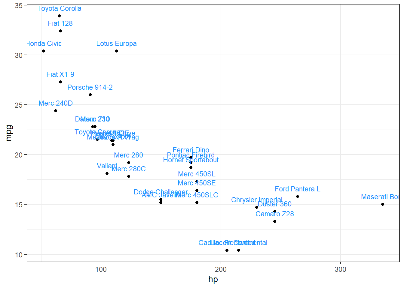
Figure 13.31: Adding labels to geoms
In figure 13.31 we can see the geometries (i.e points) have
been labelled slighly above the points (due to vjust = -1). We may
observe that some labels are overlapped. There is a fantastic package
ggrepel which works for ggplot2 plots and places the overlapped
labels in a nicer way. See figure 13.32.
# Load package
library(ggrepel)
# Set global options for max overlaps
options(ggrepel.max.overlaps = Inf)

ggplot(mtcars, aes(x = hp, y = mpg)) +
  geom_point() +
  geom_text_repel(aes(label = rownames(mtcars)),
            size = 3,
            color = "seagreen",
            vjust = -1,
            fontface = "bold.italic")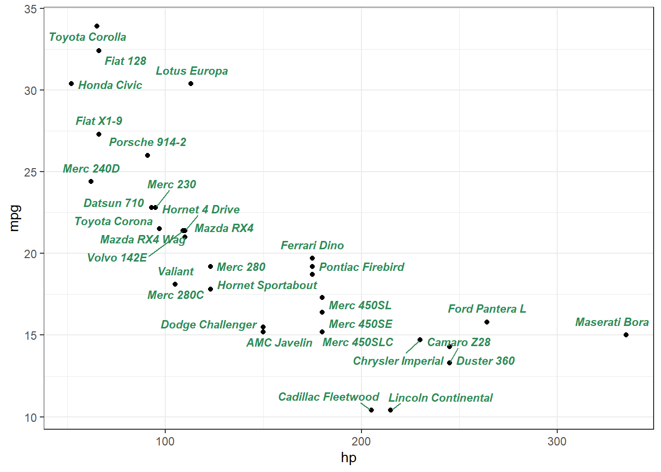
Figure 13.32: Adding labels to geoms through external ggrepel package
labelling bar charts generated through granular data using geom_bar()
may be sometimes tricky as we have to use stat functions used to
generate summary/aggregation. See Example in figure 13.33
# Labelling a bar plot
ggplot(mpg, aes(class)) +
  geom_bar() +
  geom_text(
    aes(
      y = after_stat(count + 2), # shift the label slightly
      label = after_stat(count)
    ),
    stat = "count"
  )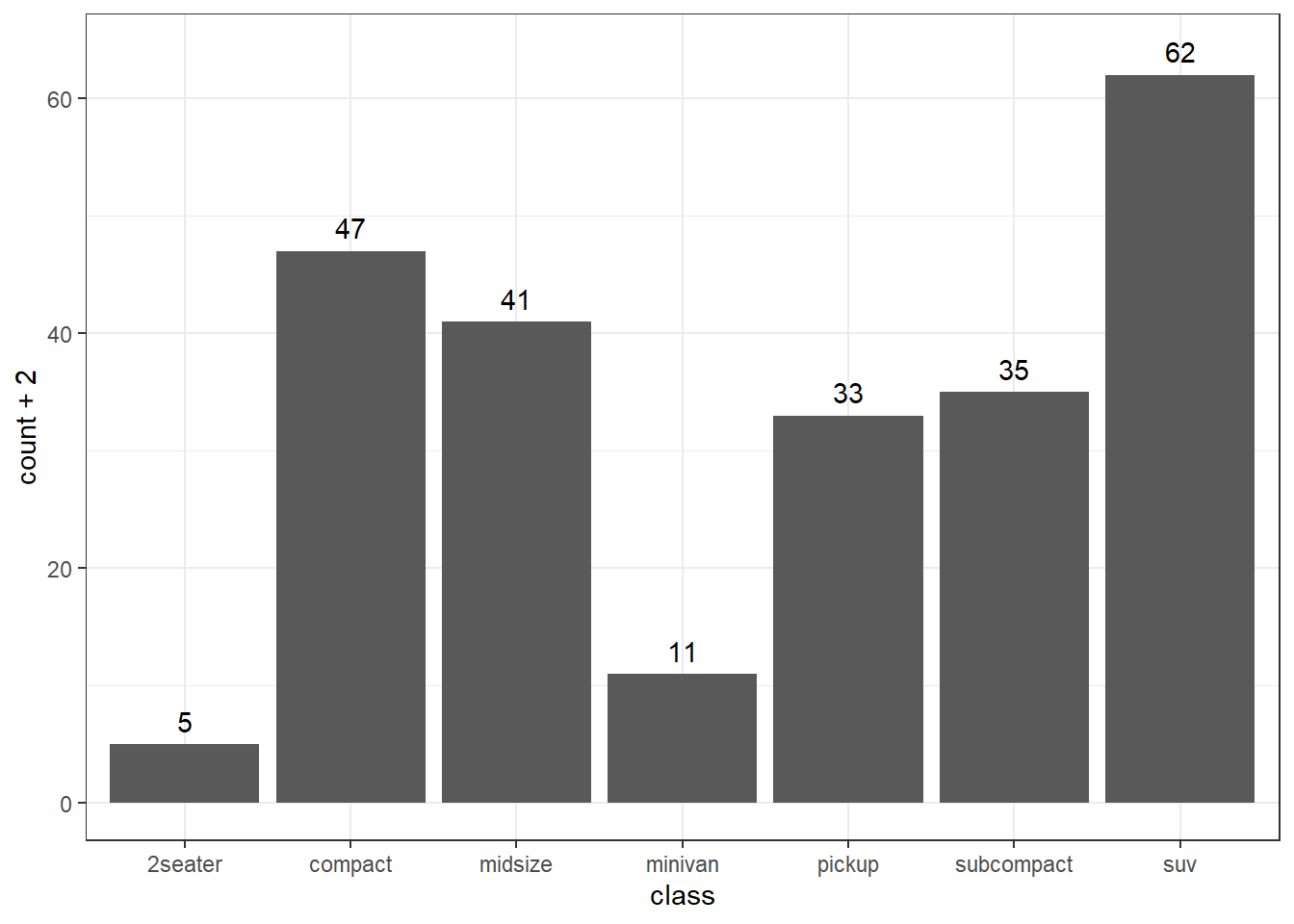
Figure 13.33: Labelled bar chart
If we want to label chart in 13.22, we have to provide some
special values aesthetics to geom_text (or geom_label). See figure
13.34.
ggplot(mpg, aes(class, cty)) +
  geom_bar(stat = "summary_bin", fun = mean) +
  geom_text(
    aes(label = after_stat(round(y, 2))),
    stat = "summary_bin",
    fun = mean,
    vjust = -0.5
  )
Figure 13.34: Bivariate bar chart labelled
One more example of labelling boxplots with maximum value for each category may be -
# Labelling the upper hinge of a boxplot,
# inspired by June Choe
ggplot(mpg, aes(displ, class)) +
  geom_boxplot(outlier.shape = NA) +
  geom_label(
    aes(
      label = after_stat(xmax),
      x = stage(displ, after_stat = xmax)
    ),
    stat = "boxplot", hjust = -0.5
  )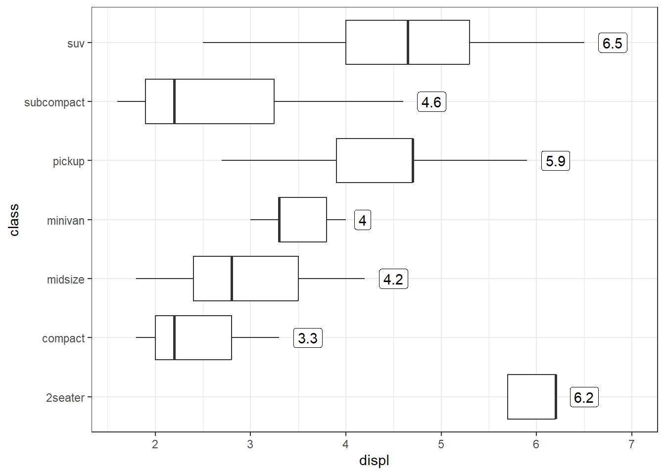
Figure 13.35: Upper Hinge labelled in Boxplot
Labeling color stacked bar charts can also get trickier, as we have to
provide appropriate position argument to geom_text layer also. See
example in figure 13.36.
ggplot(mpg, aes(class, fill = fl)) +
  geom_bar() +
  geom_text(
    aes(label = after_stat(count)),
    stat = "count",
    position = position_stack(vjust = 0.5)
  )
Figure 13.36: Colored bar chart labelled
As we have discussed the difference between geom_bar and geom_col in
details, readers may find it pretty easier to draw the above chart
(Figure 13.36) using geom_col on pre-aggregated data. Refer
figure 13.37 wherein we have to only handle the placements of
labels through position_stack argument.
mpg_agg <- mpg |>
  count(class, fl)

ggplot(mpg_agg, aes(
  x = class,
  y = n,
  fill = fl,
  label = n # provided globally
)) +
  geom_col() +
  geom_text(
    position = position_stack(vjust = 0.5) #labels centered vertically
    )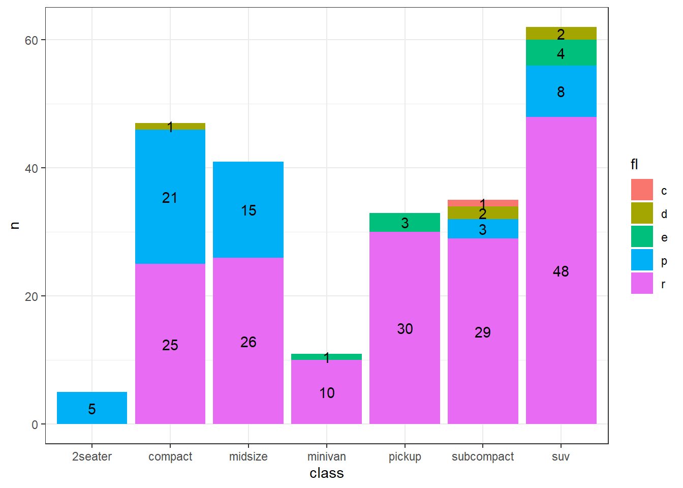
Figure 13.37: Colored bar chart labelled
13.4.6 Histograms and related plots
Readers by now, mayhave understood why ggplot2 is such a vast topic that
often it requires separate book. Full coverage in a single chapter is
nearly impossible. However, there are several other geoms which are not
as trickier as geom_bar and simultaneously useful while analysing the
data. One of those is geom_histogram which plots histogram for a
univariate numerical (continuous variable) data.
Like geom_bar it also aggregates the data itself using default
statistic stat = "bin". For a change let us now use diamonds
data-set, which is also loaded by default with ggplot2 package. It
contains over 50,000 observations for round-cut diamonds. As an example
let us visualise the distribution of carat variable.
ggplot(diamonds, aes(carat)) +
  geom_histogram()
## `stat_bin()` using `bins = 30`. Pick better value with `binwidth`.
Figure 13.38: A simple histogram
In figure 13.38 a histogram has been generated with a warning to pick better value for bin-width. So let us modify the bin-width to say, 0.025.
ggplot(diamonds, aes(carat)) +
  geom_histogram(binwidth = 0.025)
Figure 13.39: Histogram with custom binwidth
We may use bins aesthetic to choose the number of bins in histogram.
Other aestheics like fill or color may also be used.
ggplot(diamonds, aes(price, fill = cut)) +
  geom_histogram(binwidth = 500)
Figure 13.40: Filled Histogram
Related geom is geom_freqpoly (short for frequency polygon) which
display the counts with lines. So histogram in figure 13.40
may be drawn as frequency polygon usingthis geom layer. Refer figure
13.41.
ggplot(diamonds, aes(price, color = cut)) +
  geom_freqpoly(binwidth = 500)
Figure 13.41: Filled frequency polygon
To make it easier to compare distributions with very different counts,
we may put density on the y axis instead of the default count. Refer
figure 13.42.
ggplot(diamonds, aes(price, after_stat(density), colour = cut)) +
  geom_freqpoly(binwidth = 500)
Figure 13.42: Filled frequency polygon with density
13.4.7 Line Charts
Since almost all geoms in ggplot2 have been named intuitively, we can
have a correct guess that line charts canbe drawn using geom_line().
However, unlike geoms we have seen till now, geom_line() is a special
geom and works correctly in groups. It is thus sometimes referred to as
grouped or collective geom.
To understand the concept of group, let us construct a simple data,
having an index variable (for x axis), another numerical variable
values and also having a categorical variable say gr. Let us plot
values vs. index on a line plot.
# Constructing example data
set.seed(10)
exdata <- data.frame(
  gr = rep(c("G1", "G2"), 5),
  index = rep(1:5, each = 2),
  values = sample(100:200, 10)
)
# print the data
exdata
## gr index values
## 1 G1 1 108
## 2 G2 1 173
## 3 G1 2 175
## 4 G2 2 154
## 5 G1 3 171
## 6 G2 3 153
## 7 G1 4 138
## 8 G2 4 182
## 9 G1 5 187
## 10 G2 5 114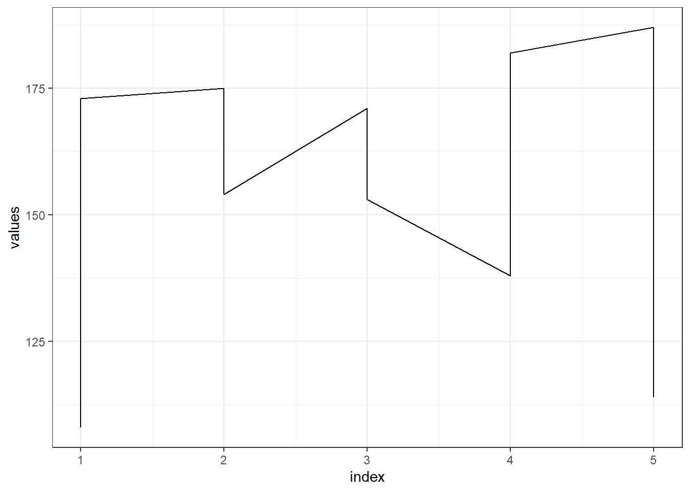
Figure 13.43: A simple line chart
In figure 13.43, we can see that values have been plotted but
for each index these have been joined first then moving onto another
index. This inadvertant thing can be fixed by use of aesthetic group.
The group aesthetic determines which observations are connected. See
figure 13.44.
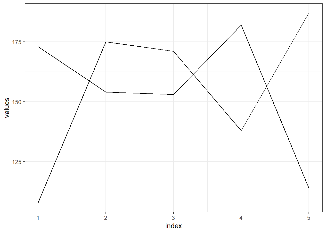
Figure 13.44: A line chart without legend
In figure 13.44, we got two different lines for each as
intended, but corresponding legend to identify the group is not there.
So, if we map color aesthetic with our group variable we can get the
legend. Moreover, mapping this aesthetic may have over-riding effect (in
this case) on group aesthetic, so this aesthetic will be kind of
redundant. Refer plot in figure 13.45.
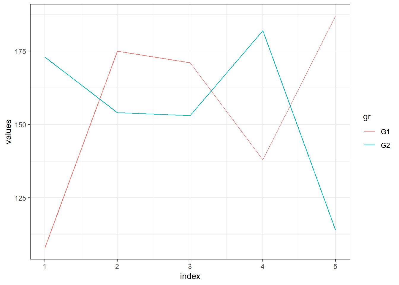
Figure 13.45: A line chart with legend
If a group isn’t defined by a single variable, but instead by a
combination of multiple variables, we may use interaction() to combine
them.
Now we will use two data-sets (i) economics and economics_long; both
of which are part of tidyr package. Readers using ggplot2 library
only are thus, advised to load the package tidyr (or alternatively
tidyverse which contains both of these packages). These data-sets
contains some economic parameters, on a monthly basis from US.
In figure 13.47, separate lines for each variable and for each of the months across the years have been plotted.
economics_long |>
  mutate(year = year(date),
         month = month(date)) |>
  ggplot(aes(year, value01, group = interaction(month, variable))) +
  geom_line()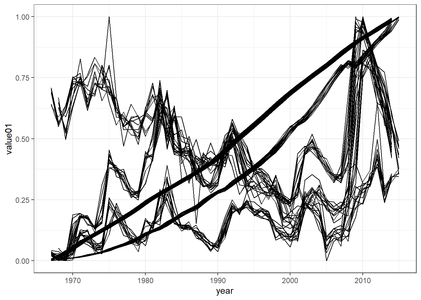
Figure 13.46: Groups in multiple variables
There is another related geom i.e. geom_path() which also draws a line
chart. While geom_line() connects points from left to right;
geom_path() connects points in the order they appear in the data. In
figure 13.47 the exdata we created earlier has been
re-arranged to show the difference. Both geom_line() and geom_path()
also understand the aesthetic linetype, which maps a categorical
variable to 'solid' (default), 'dotted' , 'dashed' and 'dotdash'
lines.
exdata |>
  # Rearranging the data points
  arrange(values) |>
  ggplot(aes(index, values)) +
  geom_line(linetype = "dotdash", linewidth = 2) +
  ggtitle("Using line geom")

exdata |>
  # Rearranging the data points
  arrange(values) |>
  ggplot(aes(index, values)) +
  geom_path(linetype = "dotted", linewidth = 2) +
  ggtitle("Using path geom")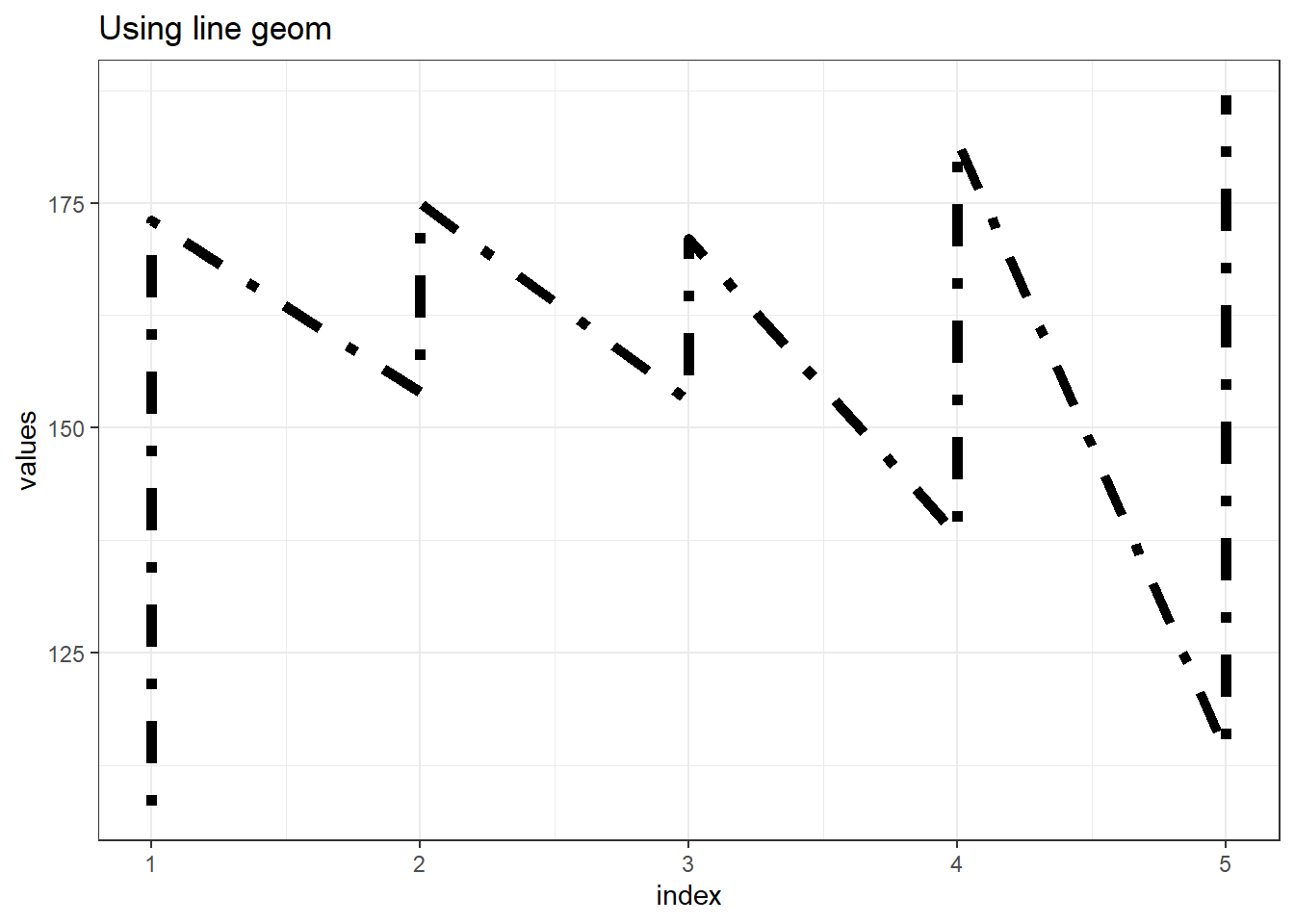
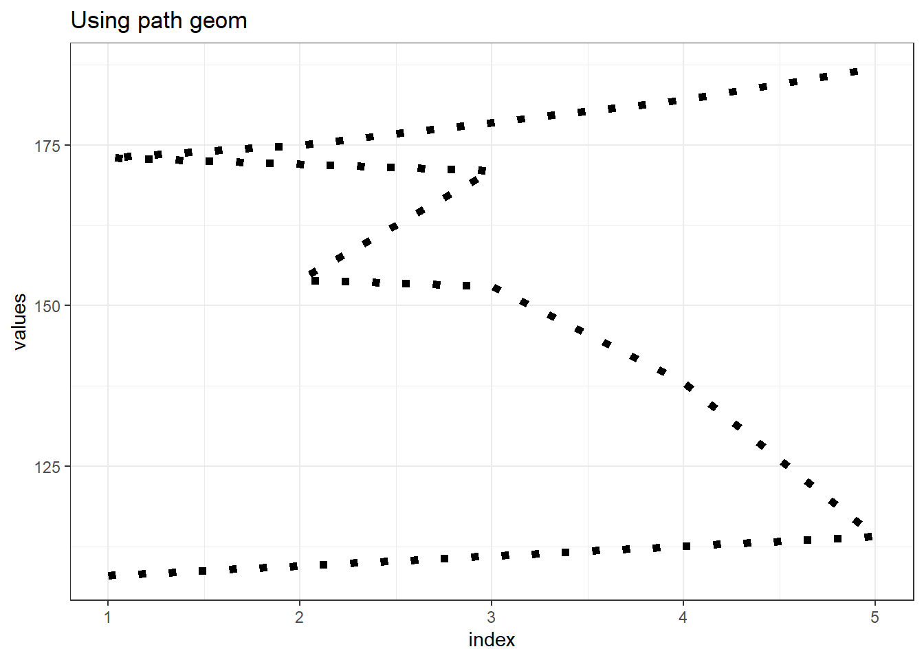
Figure 13.47: Path vs Line geoms
13.4.8 Smoothing through geom_smooth
Essentially, geom_smooth() adds a trend line over an existing plot, be
it a scatter plot or line plot. For e.g. if we draw the trend of
unemployment in US, we can use geom_smooth to see smoothed trend over
the period. Refer plot in figure 13.48.
ggplot(economics, aes(date, unemploy)) +
  geom_line(color = "indianred4", linewidth = 1) +
  geom_smooth()
## `geom_smooth()` using method = 'loess' and formula = 'y ~ x'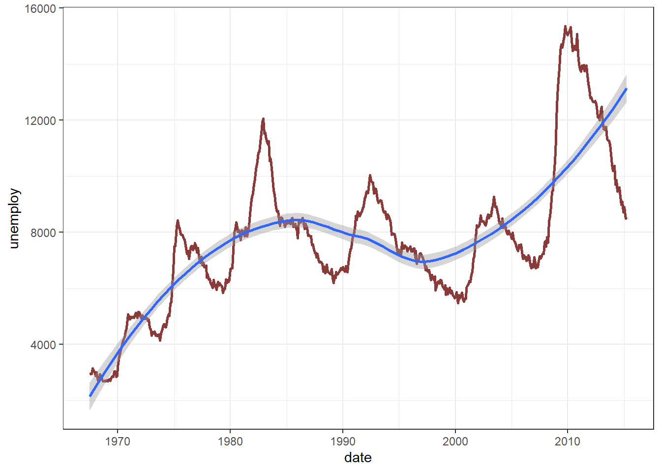
Figure 13.48: Line Chart with smoothed trend
A warning shows that method argument used to smooth the curve is
loess. The other methods available are lm, glm , gam etc. These
require formula to be provided. We may also smooth a scatter plot
using this function, to see a regression (linear) line. Refer plot in
figure 13.49.
ggplot(mpg, aes(cty, hwy)) +
  geom_point() +
  geom_smooth(method = "lm", formula = "y ~ x")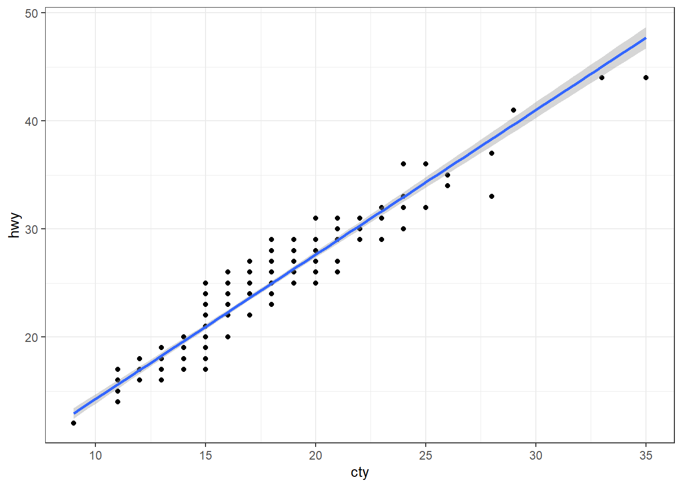
Figure 13.49: Scatter plot with regression line
Readers may note, in figure 13.49 that there much lesser
points seen in this plot than actually available due to overlapping of
points. This overlapping issue can either be solved using alpha
aesthetic or by using jitter method in scatter plots. geom_jitter
adds a random noise to the data, so that the overlapping points are seen
clearly. Jittered scatterplot may be seen in 13.50.
ggplot(mpg, aes(cty, hwy)) +
  geom_jitter() +
  geom_smooth(method = "lm", formula = "y ~ x")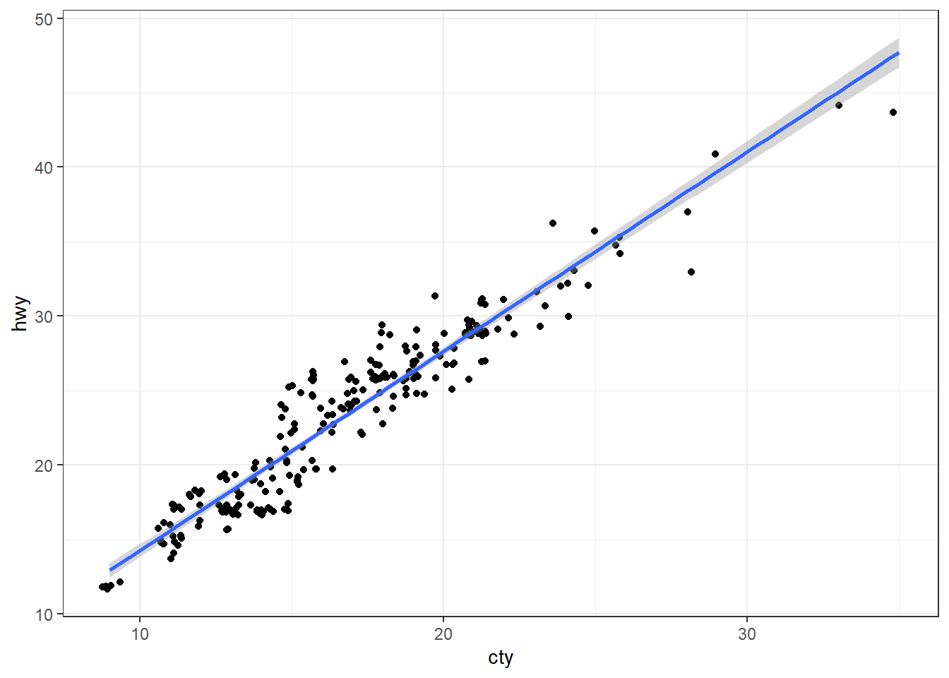
Figure 13.50: Scatter plot with regression line
13.4.9 Combining multiple geoms
We have already used multiple geoms in the same plot while labeling them as well as while smoothing the trend. Multiple geoms can be used in same plot, which will add further layers over the existing layers produced by earlier geoms. As an example let us add data points in figure 13.43.
ggplot(exdata, aes(index, values)) +
  # layer with line
  geom_line(linewidth = 1, color = "dodgerblue") +
  # layer with points
  geom_point(shape = 21, size = 7, fill = "orange", stroke = 2)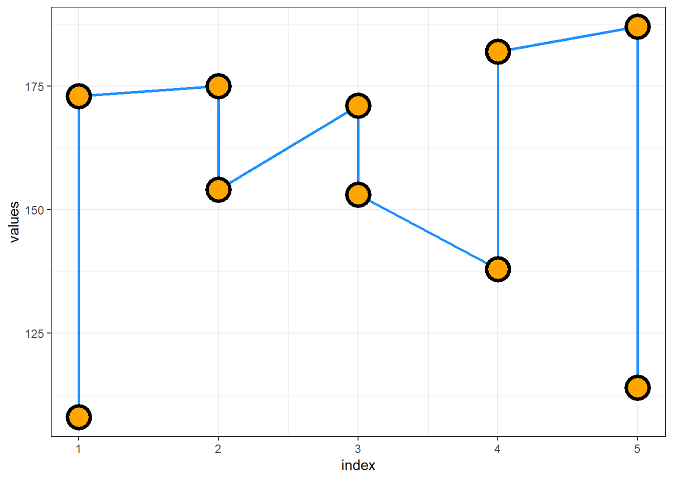
Figure 13.51: Combining Geoms
In figure 13.51 we can see that points have been added over the line. If we reverse the order, we can see in figure #ref(fig:rgg51) that line (latter layer) is drawn over points (former layer).
ggplot(exdata, aes(index, values))  +
  # layer with points
  geom_point(shape = 21, size = 7, fill = "orange", stroke = 2) +
  # layer with line
  geom_line(linewidth = 1, color = "dodgerblue")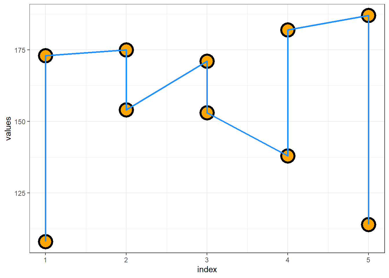
Figure 13.52: Understanding overlapping in geoms
13.4.10 Other geoms
Several other geoms which are useful to depict meaningful information in afore-mentioned charts are-
-
geom_vline(),geom_hlineorgeom_abline()to add vertical, horizontal or other reference lines in the plot. -
geom_rect()to draw a constant/reference rectangle in the data using four corners of the rectangle,xmin,ymin,xmaxandymax. -
geom_area()which draws an area plot, which is a line plot filled to the y-axis (filled lines). Multiple groups will be stacked on top of each other.
Example
ggplot(mtcars, aes(wt, mpg)) +
  geom_point() +
  geom_abline(intercept = 37, slope = -5, color = "dodgerblue") +
  geom_vline(xintercept = 3.5, color = "orange")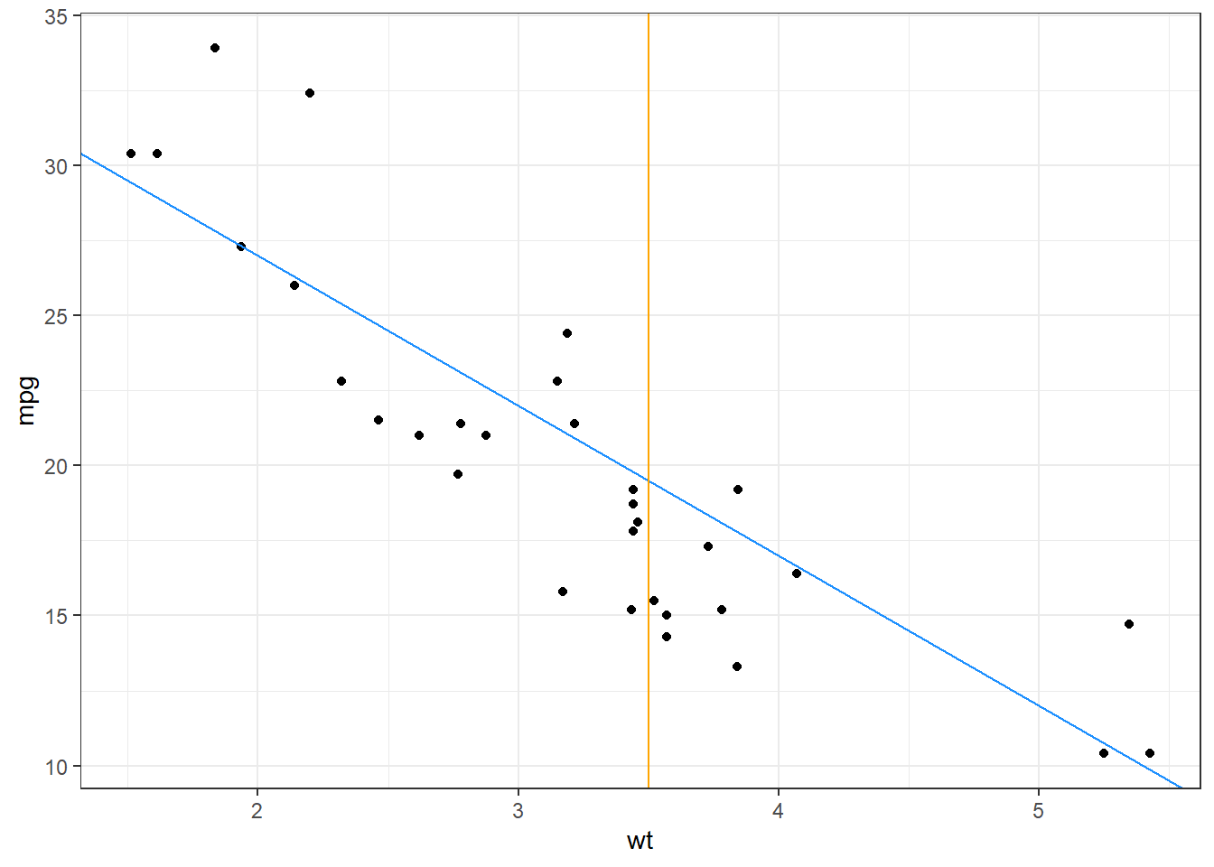
Figure 13.53: Adding reference lines
13.4.11 List of geoms available in ggplot2
Apart from the geoms discussed, there are many more geoms available in ggplot2. Some of those have been discussed in subsequent chapters/sections, as per the use case. However, readers may explore themselves those geoms if they want to explore unchartered territories.
For reference, the geoms available in the ggplot2 version used to compile the book, are listed in table 13.1 for reference.
| Entry | Title |
|---|---|
| geom_abline | Reference lines: horizontal, vertical, and diagonal |
| geom_hline | Reference lines: horizontal, vertical, and diagonal |
| geom_vline | Reference lines: horizontal, vertical, and diagonal |
| geom_bar | Bar charts |
| geom_col | Bar charts |
| geom_bin_2d | Heatmap of 2d bin counts |
| geom_bin2d | Heatmap of 2d bin counts |
| geom_blank | Draw nothing |
| geom_boxplot | A box and whiskers plot (in the style of Tukey) |
| geom_contour | 2D contours of a 3D surface |
| geom_contour_filled | 2D contours of a 3D surface |
| geom_count | Count overlapping points |
| geom_density | Smoothed density estimates |
| geom_density_2d | Contours of a 2D density estimate |
| geom_density2d | Contours of a 2D density estimate |
| geom_density_2d_filled | Contours of a 2D density estimate |
| geom_density2d_filled | Contours of a 2D density estimate |
| geom_dotplot | Dot plot |
| geom_errorbarh | Horizontal error bars |
| geom_function | Draw a function as a continuous curve |
| geom_hex | Hexagonal heatmap of 2d bin counts |
| geom_freqpoly | Histograms and frequency polygons |
| geom_histogram | Histograms and frequency polygons |
| geom_jitter | Jittered points |
| geom_crossbar | Vertical intervals: lines, crossbars & errorbars |
| geom_errorbar | Vertical intervals: lines, crossbars & errorbars |
| geom_linerange | Vertical intervals: lines, crossbars & errorbars |
| geom_pointrange | Vertical intervals: lines, crossbars & errorbars |
| geom_map | Polygons from a reference map |
| geom_path | Connect observations |
| geom_line | Connect observations |
| geom_step | Connect observations |
| geom_point | Points |
| geom_polygon | Polygons |
| geom_qq_line | A quantile-quantile plot |
| geom_qq | A quantile-quantile plot |
| geom_quantile | Quantile regression |
| geom_ribbon | Ribbons and area plots |
| geom_area | Ribbons and area plots |
| geom_rug | Rug plots in the margins |
| geom_segment | Line segments and curves |
| geom_curve | Line segments and curves |
| geom_smooth | Smoothed conditional means |
| geom_spoke | Line segments parameterised by location, direction and distance |
| geom_label | Text |
| geom_text | Text |
| geom_raster | Rectangles |
| geom_rect | Rectangles |
| geom_tile | Rectangles |
| geom_violin | Violin plot |
| geom_sf | Visualise sf objects |
| geom_sf_label | Visualise sf objects |
| geom_sf_text | Visualise sf objects |
| update_geom_defaults | Modify geom/stat aesthetic defaults for future plots |
13.5 Modifying scales
Scales in ggplot2 control the mapping from data to aesthetics so that the data can be seen. In other words, these provide us a way to customise aesthetics such as size, color, position, shape, etc.
In the charts we have generated so far, the aesthetic mappings with data were default and we haven’t customised those default scales. We may divide our customisation requirements of these scales into three broad categories, which we will learn in this section.
- Modifying scales related to position aesthetics,
- Modifying scale related to color (or fill) aesthetics,
- Scales mapped to other aesthetics.
13.5.1 Modifying scales mapped to position aesthetics i.e. transforming axes
We have seen that default coordinate system used by ggplot2 is Cartesian
and to plot the data two position aesthetics x and y are required.
While drawing figure 13.3 we provided these aesthetics
explicitly, whereas at the time of drawing bar chart in 13.20
we provided one x aesthetic and ggplot2 generated y aesthetic by
itself (remember after_stat(count)).
To customise position scales we have scale_*_#() group of functions,
where * represent position aesthetic usually x or y; and #
represents variable type. For example we have these two functions for
continuous axis/variables.
scale_x_continuous(name, breaks, labels, limits, trans)
scale_y_continuous(name, breaks, labels, limits, trans)
In arguments to above functions, we can see that axis title (name), axis
breaks, axis labels, axis limits, and transformations can be dealt with.
See the following examples wherein we have changed the limits of axes,
renamed them using scale functions (Refer 13.54).
# Basic Scatter Plot
ggplot(cars, aes(x = speed, y = dist)) +
  geom_point()
# Modifying scales both axis title and axis limits
ggplot(cars, aes(x = speed, y = dist)) +
  geom_point() +
  scale_x_continuous(name="Speed of cars", limits=c(10, 15)) +
  scale_y_continuous(name="Stopping distance", limits=c(0, 150))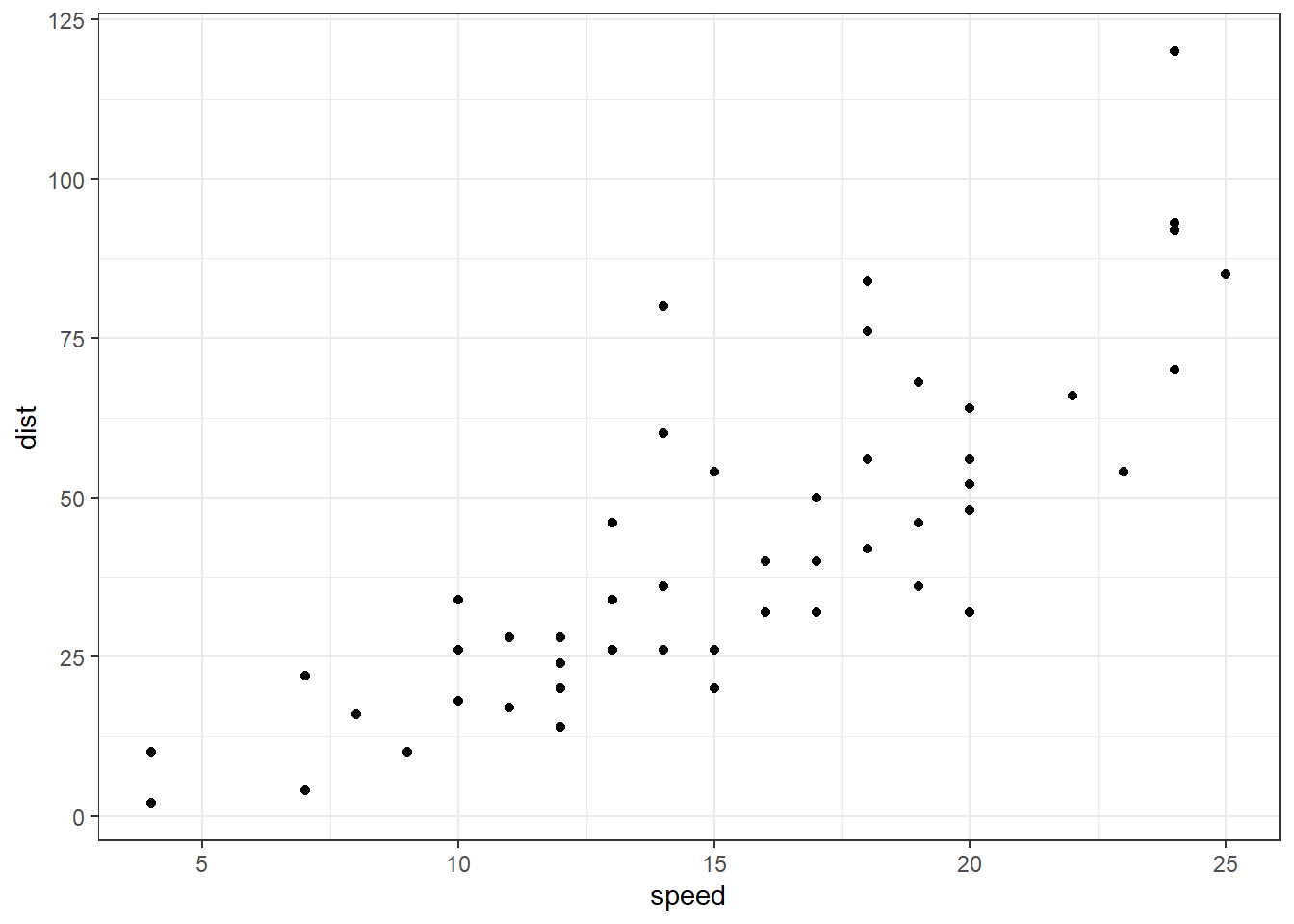
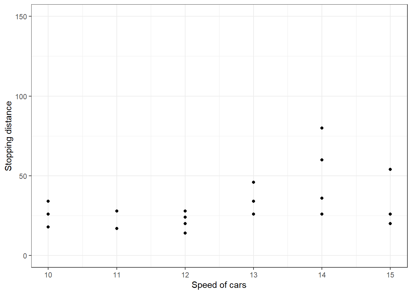
Figure 13.54: Modifying Scales in GGplot2
We can also applying transformation on axes using trans argument
(refer figure 13.55).
ggplot(cars, aes(x = speed, y = dist)) +
  geom_point()+
  scale_x_continuous(trans='log10') +
  scale_y_continuous(trans='log10')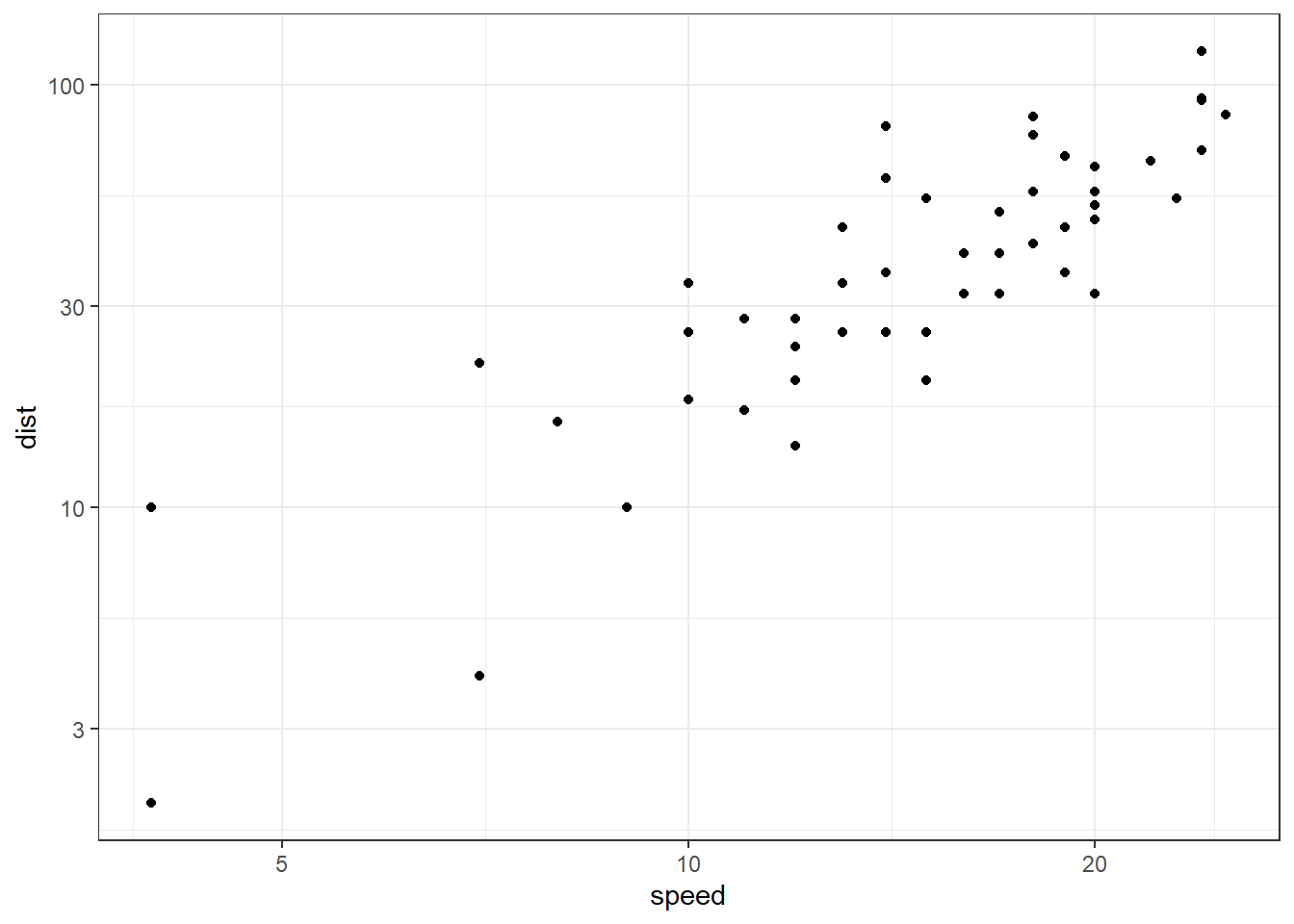
Figure 13.55: Transforming Axes in GGplot2
The transformation is actually carried out by a "transformer", which describes the transformation, its inverse, and how to draw the labels. A Few of these transformations are listed in table 13.2 following.
| Name | Equivalent function \(f(x)\) |
|---|---|
"asn" |
\(\tanh^{-1}(x)\) |
"exp" |
\(e ^ x\) |
"identity" |
\(x\) |
"log" |
\(\log(x)\) |
"log10" |
\(\log_{10}(x)\) |
"log2" |
\(\log_2(x)\) |
"logit" |
\(\log(\frac{x}{1 - x})\) |
"probit" |
\(\Phi(x)\) |
"reciprocal" |
\(x^{-1}\) |
"reverse" |
\(-x\) |
"sqrt" |
\(x^{1/2}\) |
However, there are certain scale functions dedicated to transform axes in ggplot2. Some of these are listed below. Obviously all these functions have corresponding y variants available.
Of these, scale_x_reverse or its y variant are sometimes really useful.
In the above examples, though we have seen scale functions dealing with numerical data, we have plenty of other functions to deal with other data. Such as,
scale_x_datescale_x_datetime()scale_x_discrete()scale_x_binned()
One example of using date scale can be of economics data. (refer figure 13.56).
ggplot(economics, aes(date, psavert)) +
  geom_line() +
  scale_x_date(name = "Year",
               date_breaks = "2 years",
               date_labels = "%y",
               limits = c(ymd("19800101"), ymd("19991231"))) +
  scale_y_continuous(name = "Personal Savings Rate",
                     labels = scales::label_percent(scale = 1))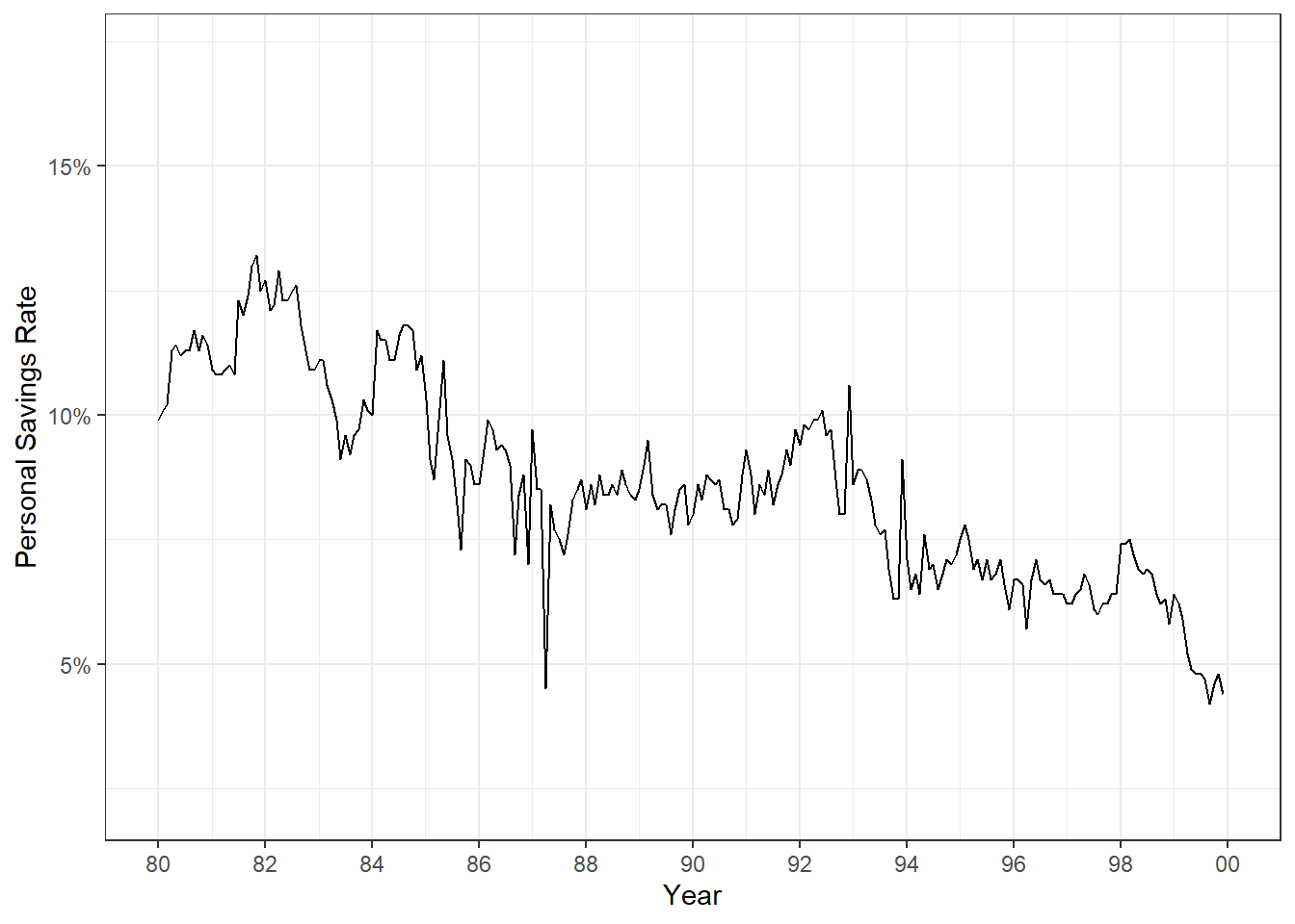
Figure 13.56: Transforming Axes in GGplot2
In figure 13.56, we have modified (i) name of x axis, (ii) breaks, which places the label, (iii) label for 2 digits of year, (iv) limited the data to be plotted using limits, (v) name of y axis and (vi) modified the bales of y axis as percentages; all using scale functions.
Readers may have noticed that we have modified the axes lables in plot in figure 13.56 using scales package. Using scales library we may modify format of labels (refer plot in figure 13.57).
state.x77 %>%
  as.data.frame() %>%
  ggplot(aes(Area, Illiteracy/100)) +
  geom_point(size = 3, color = "dodgerblue") +
  scale_x_continuous(name = "Area in Square Miles", labels = scales::label_comma()) +
  scale_y_continuous(name = "Illiteracy as % of Population", labels = scales::label_percent())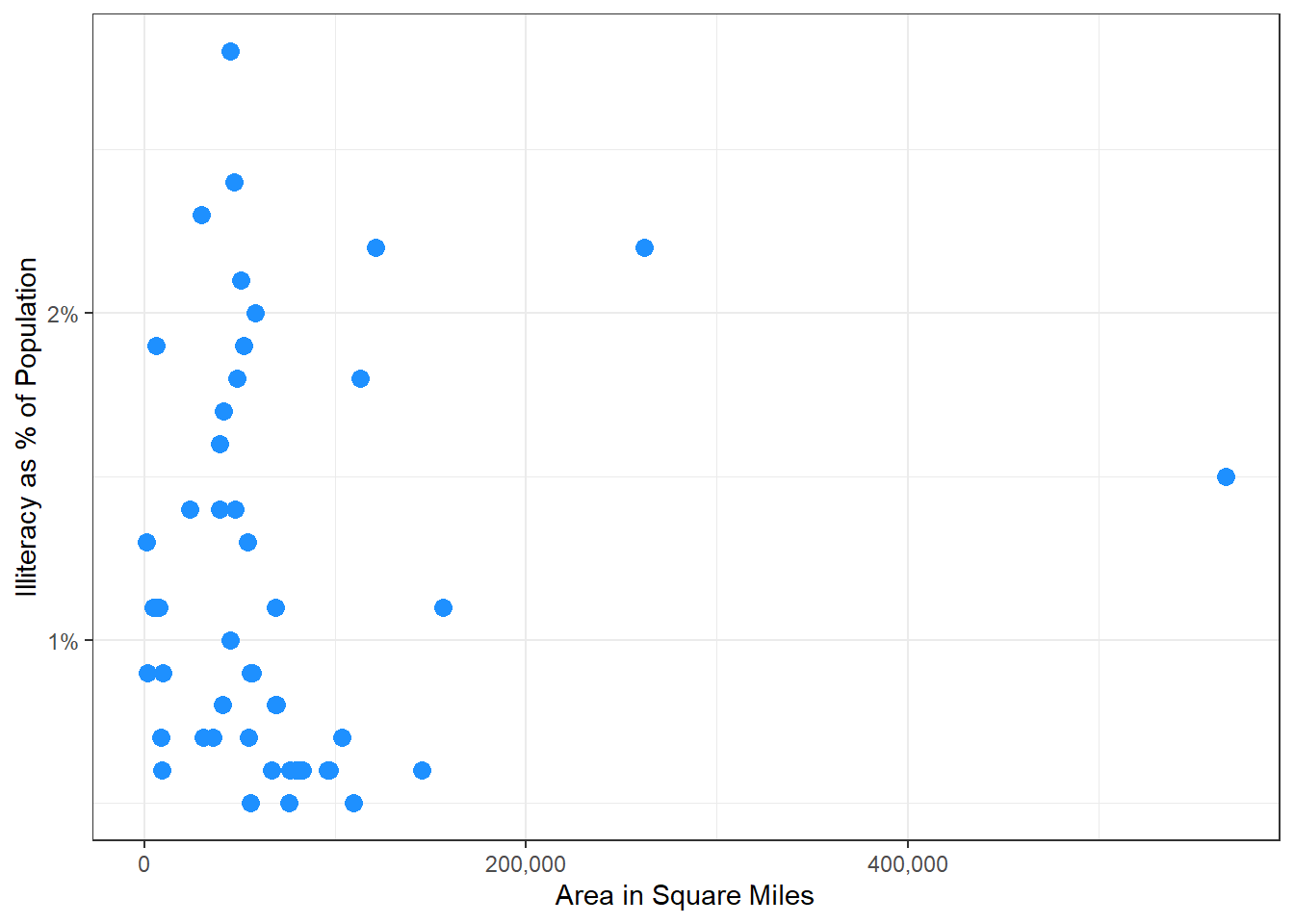
Figure 13.57: Transforming Axes in GGplot2
Some other functions in scales library useful for displaying numerical data on axes are -
-
scales::label_bytes()formats numbers as kilobytes, megabytes etc. -
scales::label_dollar()formats numbers as currency. -
scales::label_ordinal()formats numbers in rank order: 1st, 2nd, 3rd etc. -
scales::label_pvalue()formats numbers as p-values: <.05, <.01, .34, etc. scales::label_date()-
scales::label_date_short()formats dates -
scale::label_wrap()useful to wrap long strings across multiple lines.
In figure 13.56, though we have limited the scale for a fixed duration, readers may notice that there is still an empty space on both sides of the scale. In figure 13.23 the space between y axis labels and bars may be annoying to some. To modify this empty space on scales (usually position scales) we can use expand argument of scale_*_* function through another function expansion. This function expansion has two arguments namely mult and add.
-
multargument takes a vector with two numeric elements which indicate range expansion factors. -
addargument also takes a vector with two numeric elements but these indicate additive range expansion constants.
To understand this let’s again consider the example in figure 13.23. Providing mult = c(0, 0.2) in expansion multiplies x axis (continuous in this case) with 0 times on left side, and 0.2 times of limit on right side. See output in figure 13.58.
aggregated_mpg <- mpg |>
  summarise(mean_cty = mean(cty),
            .by = class)

ggplot(aggregated_mpg, aes(x = mean_cty, y = class)) +
  geom_bar(stat = "identity") +
  scale_x_continuous(expand = expansion(mult = c(0, 0.2)))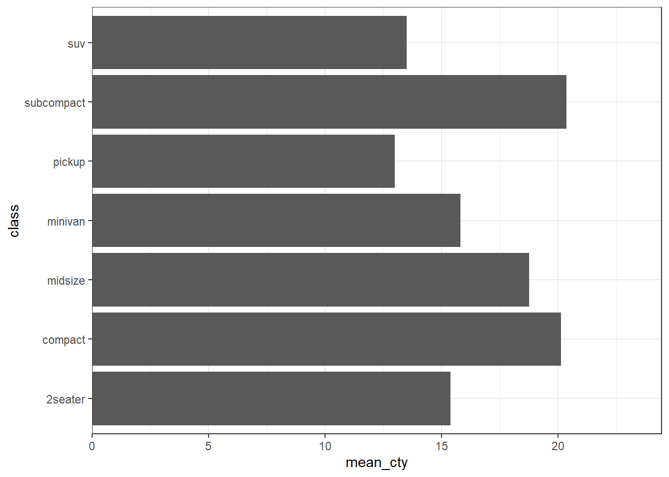
Figure 13.58: Modifying scale limits though expansion
13.5.2 Adding secondary position axis
Most of the times two different position aesthetics are shown in same plot having different scales altogether. In such cases secondary axes can be useful for comparing datasets with different magnitudes or units, allowing for a clearer representation of diverse data sets within a single chart. However, caution is needed as secondary axes can sometimes lead to misleading interpretations. If not used carefully, they might obscure important trends or create confusion, especially if the scale differences are not immediately obvious to the viewer.
Secondary axes can be added in ggplot2, using sec_axis function as an argument to sec.axis inside scales. As an example, we can see the two y axis representing same data both in degree Fahrenheit and degree Celsius in figure 13.59. First argument of sec_axis takes a transformation function using tidyverse style syntax. Another useful argument is name apart from other usual functions like labels, etc.
airquality |>
  mutate(Month = factor(month.abb[Month], ordered = TRUE, levels = month.abb)) |>
  ggplot(aes(fct_rev(Month), Temp)) +
  geom_bar(
    stat = "summary",
    fun = mean
  ) +
  scale_y_continuous(name = "Average Temp (\u00B0F)",
                     expand = expansion(mult = c(0, 0.1)),
                     sec.axis = sec_axis(~ (. - 32) * 5 / 9,
                                         name = " Average Temp (\u00B0C)")) +
scale_x_discrete(name = "Month") 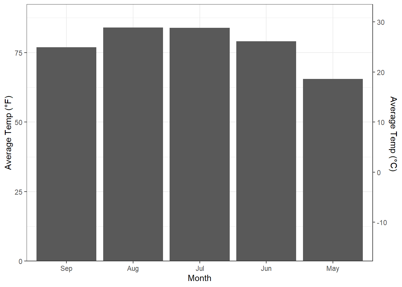
Figure 13.59: Adding Secondary Axis
13.5.3 Customising color (or fill) mappings
Readers are advised to read appendix A wherein we have discussed color aesthetic in pretty details. By far we know that continuous data if mapped to a color aesthetic gives us a gradient color scale and discrete data on the other hand, provides us discrete color values.
For continuous variables we thus have scale_fill_continuous() function
in turn defaulting to scale_fill_gradient(). In other words, the
default colors are picked by scale_fill_gradient function, which uses
following mentioned colors. Readers may also note that all fill scale
functions have a corresponding color scale function to be used with
color aesthetic.
scale_colour_gradient(
  name = waiver(),
  ...,
  low = "#132B43",
  high = "#56B1F7",
  space = "Lab",
  na.value = "grey50",
  guide = "colourbar",
  aesthetics = "colour"
)
So we may change the desired colors in the color gradient. There are two more related scales.
-
scale_fill_gradient2()which produces a three-colour gradient with specified midpoint -
scale_fill_gradientn()which produces an n-colour gradient.
The usage may be clear with the following examples.
economics |>
  mutate(month = month(date, label = TRUE, abbr = TRUE),
         year = year(date)) |>
  ggplot(aes(year, month)) +
  geom_tile(aes(fill = psavert)) +
  scale_fill_gradient2(low = "red",
                       high = "seagreen",
                       midpoint = mean(economics$psavert))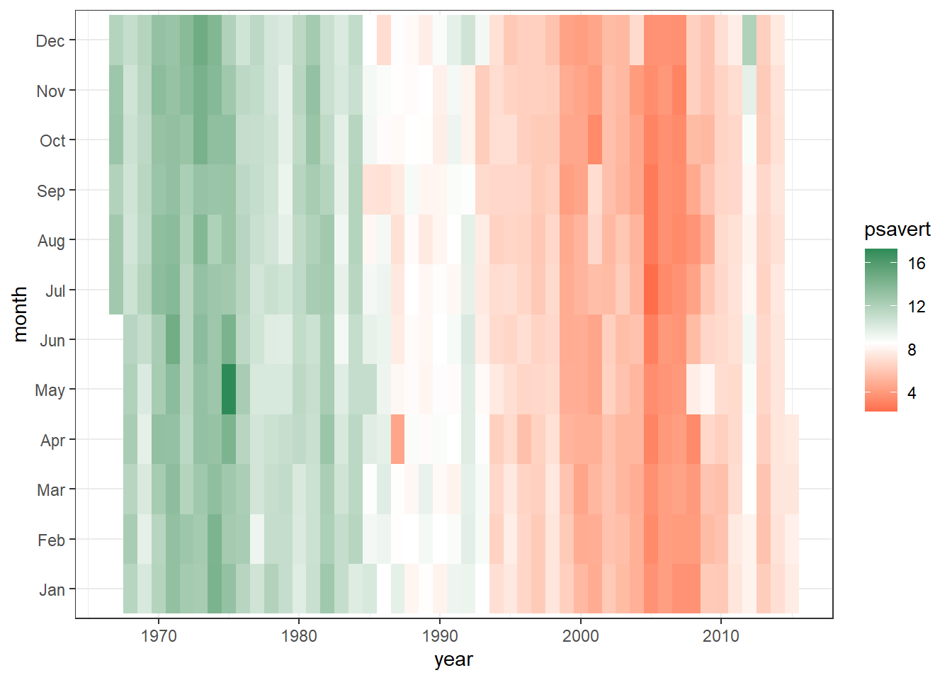
Figure 13.60: Customising Fill scale
If however, the variable mapped with fill or color scale is
discrete, the default scale picked up by ggplot2 is
scale_fill_discrete which picks its values from corresponding
scale_fill_hue() by default.
However, for discrete color/fill scales it is advised to use brewer
palettes as described in Appendix A, due to slight
complexity involved in hue scales. Moreover, if we want to pick our
colors manually, we may use scale_fill_manual() which takes color
values from a named vector where names are the categories available in
the variable. See the following example in figure 13.61.
ggplot(mpg, aes(fl, fill = fl)) +
  geom_bar()

ggplot(mpg, aes(fl, fill = fl)) +
  geom_bar() +
  scale_fill_manual(values = c(c = "seagreen", d = "tomato4",
                               e = "dodgerblue", p = "cadetblue3",
                               r = "indianred"))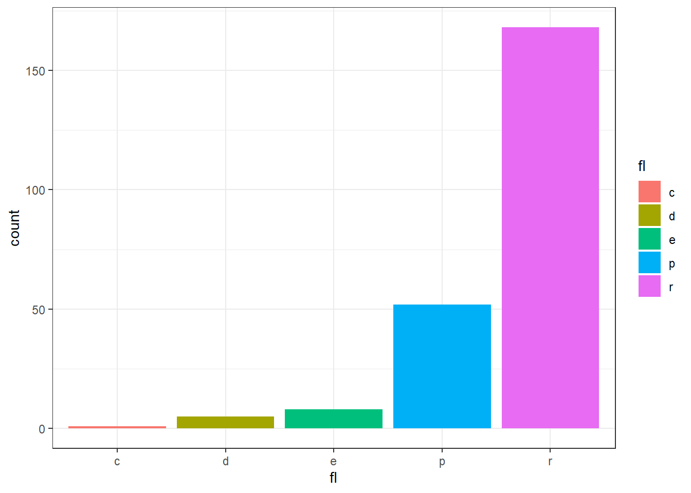
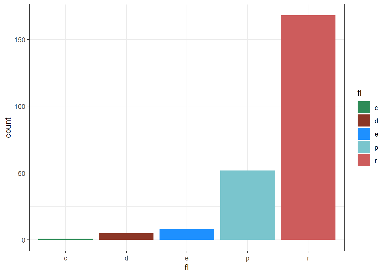
Figure 13.61: Customising Fill scale manually
Another set of scales in ggplot2, sometimes useful are
scale_color_identity() which are useful when the data has already been
scaled, i.e. it already represents aesthetic values that ggplot2 can
handle directly. See the following example in figure 13.62.
df <- data.frame(
  x = 1:4,
  y = 1:4,
  colour = c("red", "green", "blue", "yellow")
)

ggplot(df, aes(x, y)) +
  geom_tile(aes(fill = colour))

ggplot(df, aes(x, y)) +
  geom_tile(aes(fill = colour)) +
  scale_fill_identity()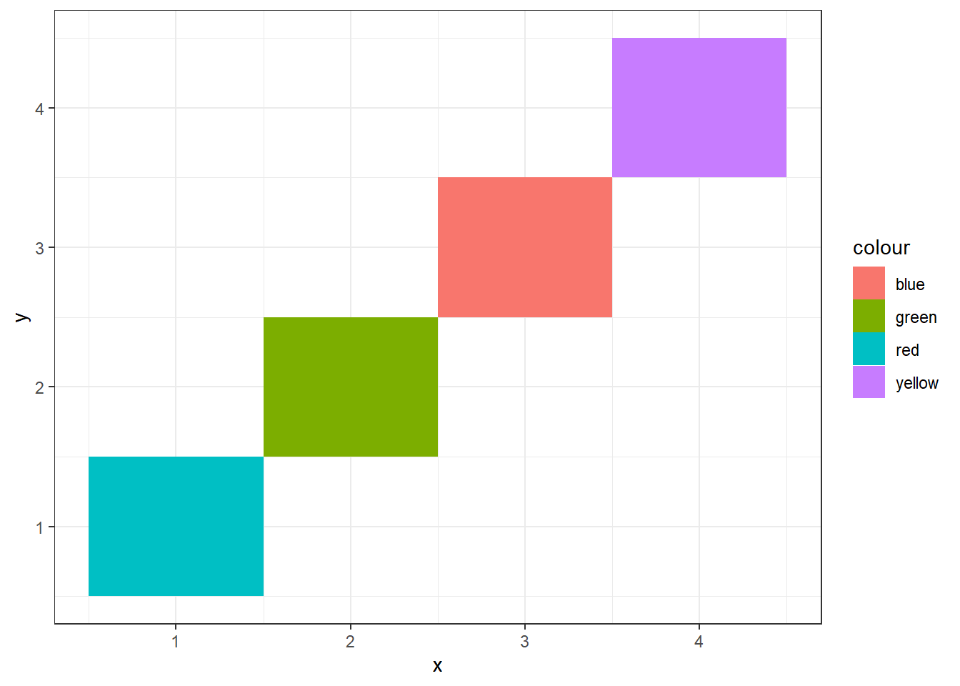
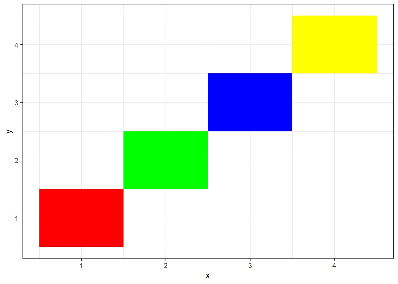
Figure 13.62: Identity Color Scale
13.5.4 Other scale aesthetics
Similar to position and color/fill scales there are scale functions for
other aesthetics which are appropriately named and can be used to modify
mappings as per our requirement. For e.g. to change shape aesthetic with
that of values available in data, we have scale_shape_identity() or to
change shapes manually we have scale_shape_manual which takes a named
vector. Readers are advised to go through these functions through their
help pages and use-cases by themselves.
13.6 Coordinate systems
So far, we know that default coordinate system adopted by ggplot2 is
Cartesian, which requires x and y position aesthetics to map data in
two-dimensional plots. It uses coord_cartesian() function along with
its default values. Other linear coordinate systems are coord_flip(),
which flips x and y axes; and coord_fixed() which preserves the fixed
aspect ratio.
coord_cartesian() has arguments xlim and ylim which can be used to
set limits of x and y axes respectively, but unlike limits
argument of scale_*_* function does not discard the data, which is out
of the limits. As an example, refer three plots in Figure
13.63, wherein scale_x_continuous has changed the shape of
smoothed curve as the data out of the plot has been discarded.
base <- ggplot(mpg, aes(displ, hwy)) +
  geom_point() +
  geom_smooth()

# Full dataset
base

# Scaling to 4--6 throws away data outside that range
base + scale_x_continuous(limits = c(4, 6))

# Zooming to 4--6 keeps all the data but only shows some of it
base + coord_cartesian(xlim = c(4, 6))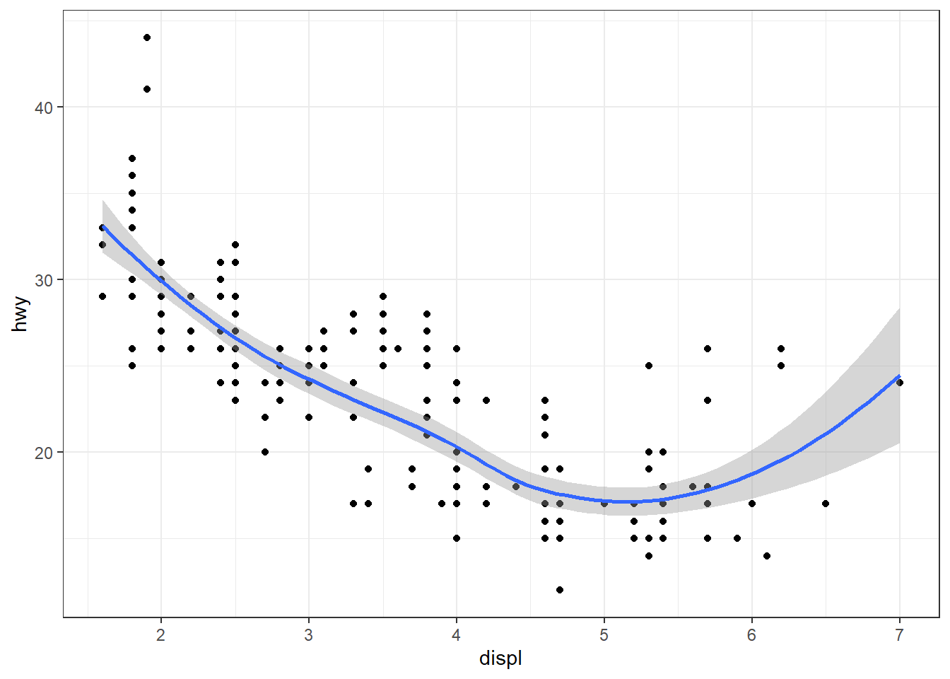
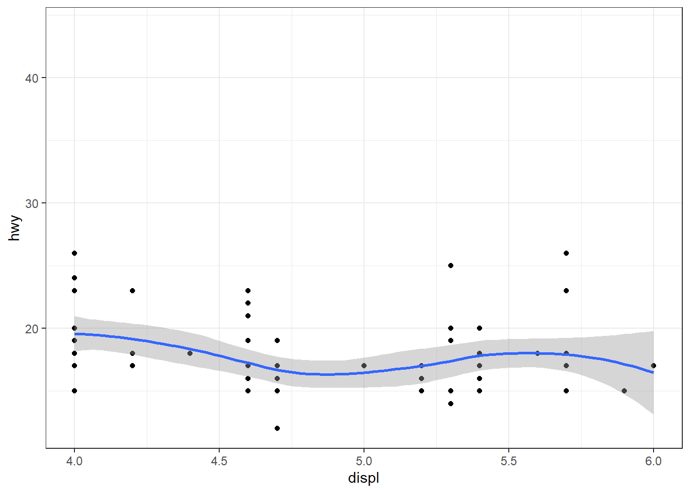
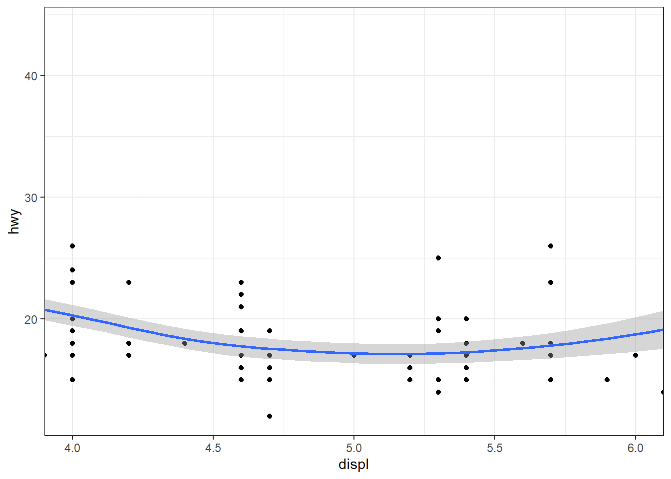
Figure 13.63: Setting limits
Another coordinate system coord_flip, flips the axes and is useful to
flip the axes. One thing to note that here x axis is drawn vertically
and thus, if any geom is drawn which takes x value will take the
values from vertical axis and not from horizontal axis.
However there are other coordinate systems available in ggplot2, which have been listed in table 13.3 for ready reference.
| Entry | Title |
|---|---|
| coord_cartesian | Cartesian coordinates |
| coord_fixed | Cartesian coordinates with fixed “aspect ratio” |
| coord_equal | Cartesian coordinates with fixed “aspect ratio” |
| coord_flip | Cartesian coordinates with x and y flipped |
| coord_map | Map projections |
| coord_quickmap | Map projections |
| coord_munch | Munch coordinates data |
| coord_polar | Polar coordinates |
| coord_radial | Polar coordinates |
| coord_trans | Transformed Cartesian coordinate system |
| coord_sf | Visualise sf objects |
Out of the listed coordinate systems, some are really important and cannot be skipped for gaining the basic architecture of ggplot2. Do you know that a pie chart is basically a bar chart drawn in polar coordinate system? The answer is yes. So let’s understand polar coordinate system and recently introduced radial coordinate system which help us to draw a pie chart.
In the following code, a 100% stacked bar chart (flipped on y axis) is
converted to a pie chart by adopting coord_polar() and to a bulls-eye
chart by setting theta position aesthetic to "y" position. Refer
three plots in figure 13.64.
base <- ggplot(mtcars, aes(y = factor(1), fill = factor(cyl))) +
  geom_bar(width = 1) +
  scale_y_discrete(name = NULL,
                   guide = "none",
                   expand = c(0, 0)) +
  scale_fill_discrete(guide = "none")

# Stacked barchart
base

# Pie chart
base + coord_polar()

# The bullseye chart
base + coord_polar(theta = "y")
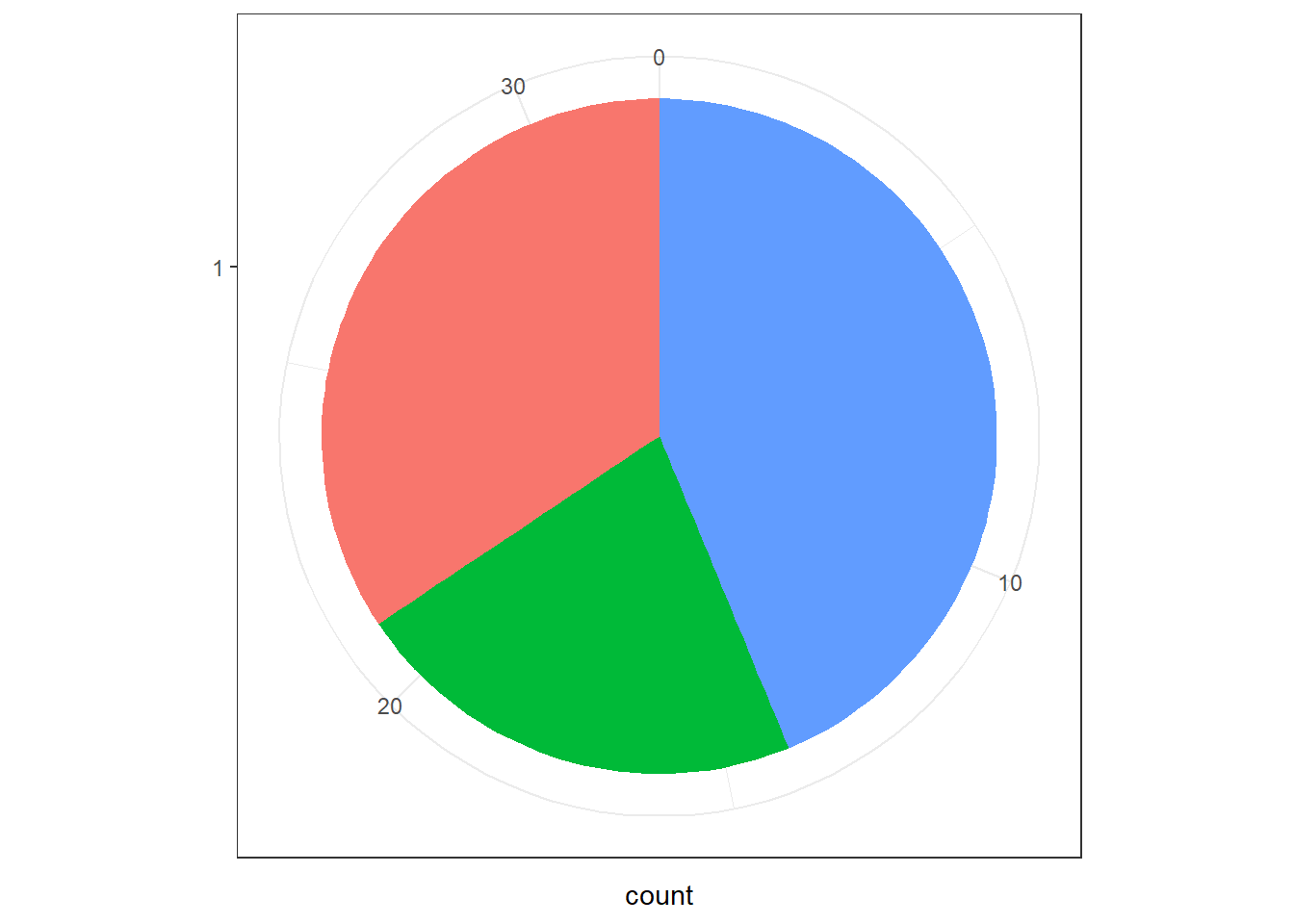
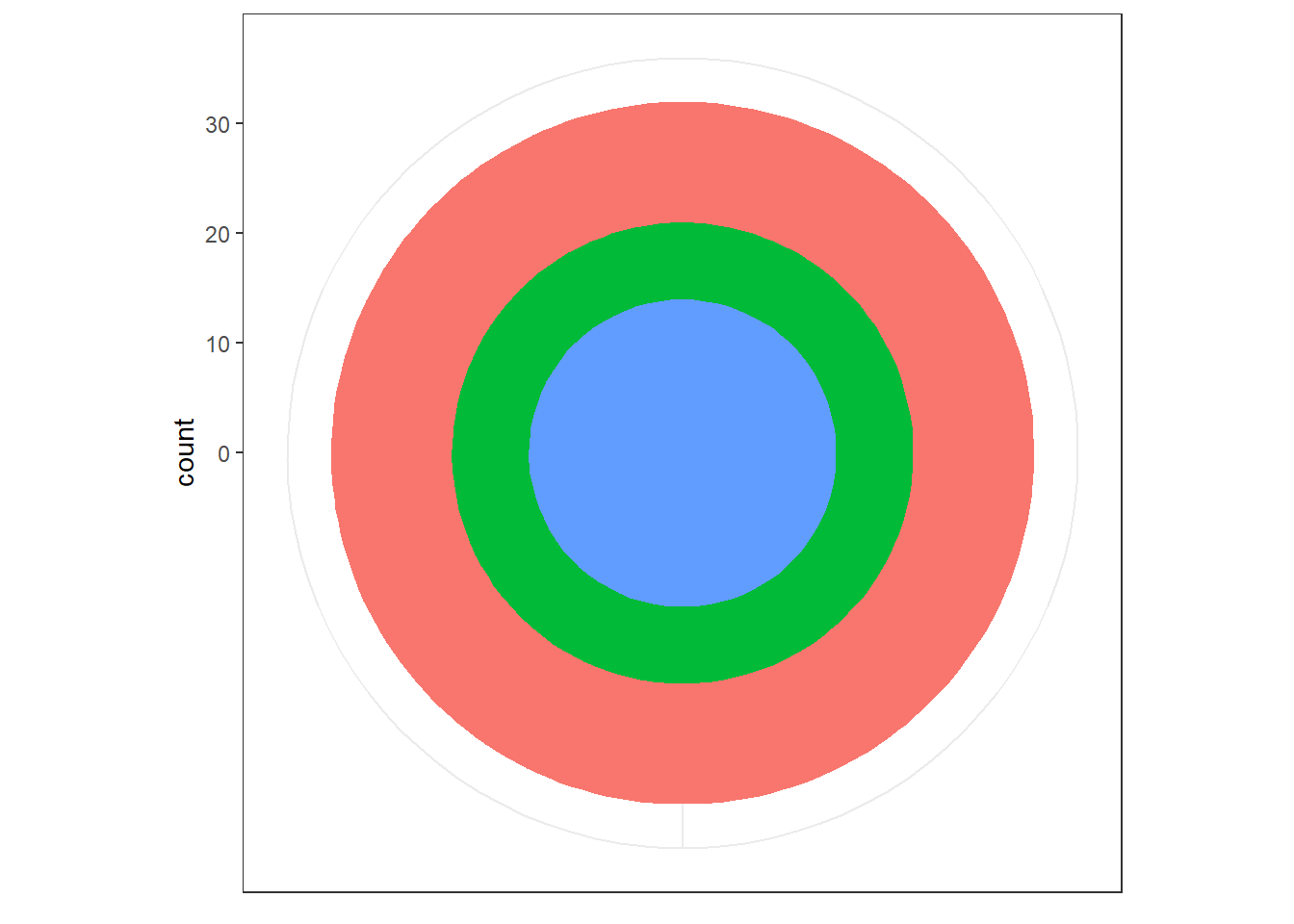
Figure 13.64: Polar Coordinates
By recently introduced coord_radial which is specifically designed for
pie charts, the base layer (i.e. 100% stacked bar chart) can be
converted to a pie chart. (Refer plots in figure 13.65.)
# With default value
base + coord_radial()

# Without expansion
base + coord_radial(expand = FALSE)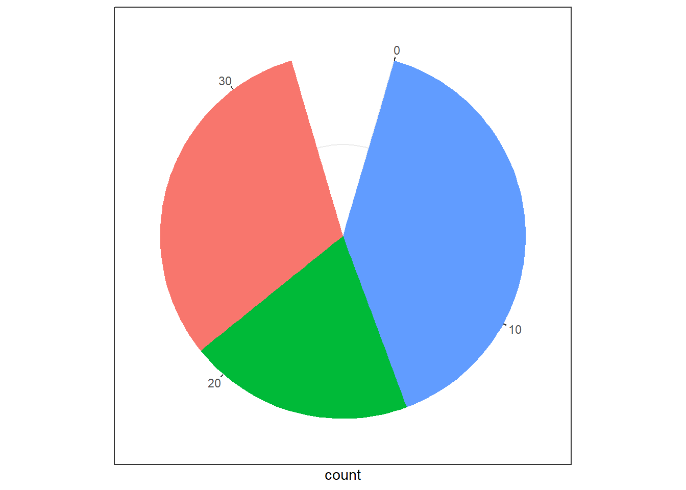
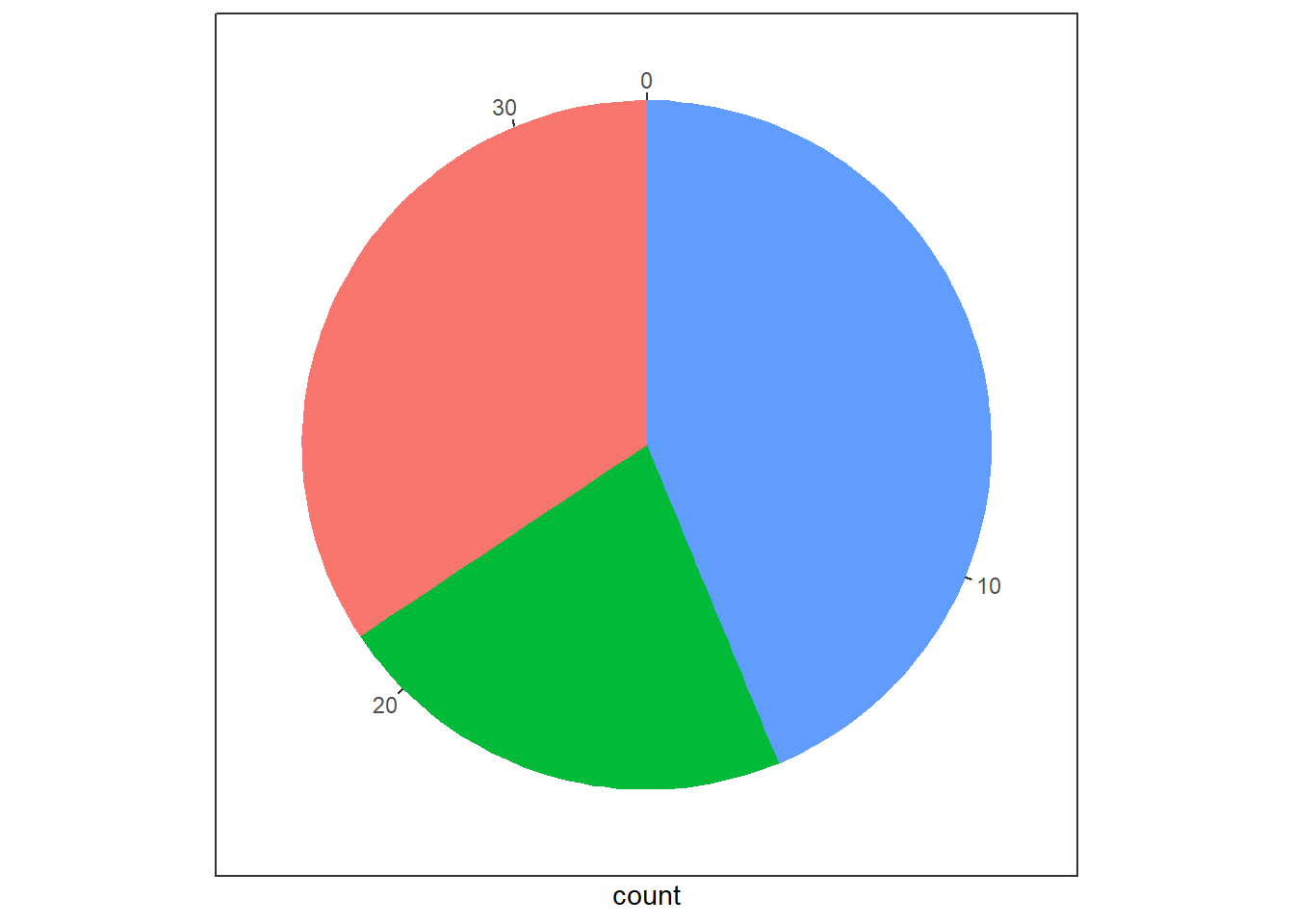
Figure 13.65: Using Radial Coordinates
The coord_radial can also be used to create donut charts easily by
setting parameter inner.radius as can be seen in Figure
13.66.
# Donut Chart
base + coord_radial(expand = FALSE,
                    inner.radius = 0.5)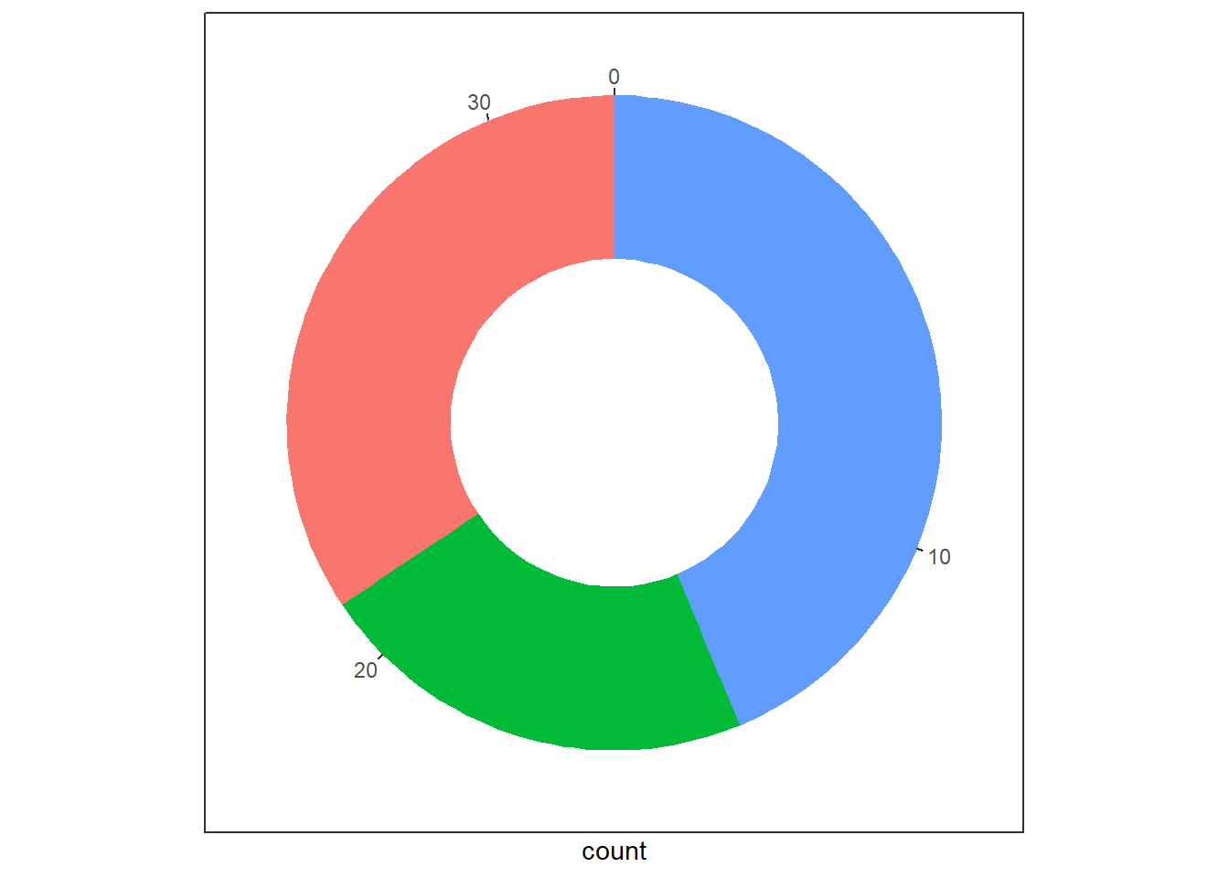
Figure 13.66: Donut Charts with Radial Coordinates
coord_radial also places the labels automatically, while adjusting
inner.radius. Refer plots in 13.67.
base2 <- mpg |>
    count(class) |>
  ggplot(aes(y = n, x = "", fill = class)) +
  geom_col() +
  geom_text(aes(label = n),
                 position = position_stack(vjust = 0.5))

base2 + coord_polar(theta = "y")

base2 +
  coord_radial(expand = FALSE,
               theta = "y",
               inner.radius = 0.5)
Figure 13.67: Labels adjustments in Donut Charts with Radial Coordinates
Though there is a lot more that can be done in coord_radial , one
final example of using coord_radial can be drawing bar plots in
circle, as shown in figure 13.68.
mtcars |>
  #arrange(-mpg) |>
  rownames_to_column('Car') |>
  ggplot(aes(seq_along(mpg), mpg, fill = factor(cyl))) +
  geom_col(width = 1,
           color = "white") +
  geom_text(aes(y = 32, label = Car),
            angle = 90,
            hjust = 1) +
  geom_text(
    aes(y = 32, label = mpg),
    angle = 90,
    hjust = -1,
    fontface = "bold"
  ) +
  coord_radial(rotate.angle = TRUE, expand = FALSE)  +
  scale_fill_manual(values = c("dodgerblue", "seagreen", "orange"), guide = "none") +
  theme_void() +
  theme(panel.background = element_rect(fill = "aliceblue")) +
  ggtitle("Miles per gallon for different cars") +
  theme(plot.title = element_text(size = 15,
                                  face = "bold", hjust = 0.5))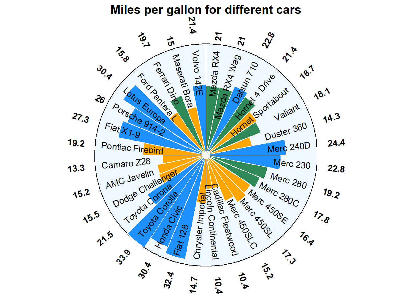
Figure 13.68: Bar plot in circle
13.7 Faceting
The amount of data also makes a difference: if there is a lot of data it can be hard to distinguish different groups. An alternative solution is to use faceting, as described next. Facets, or “small-multiples”, are used to split one plot into a multi-panel figure, with one panel (“facet”) per group of data. The same type of plot is created multiple times, each one using a sub-group of the same dataset.
In ggplot2 faceting can be achieved using either of the functions -
-
facet_grid()creates a grid of plots, with each plot showing a subset of the data. We may also specify the number of columns to use in the grid using thencolargument. -
facet_wrap()creates a grid of plots with different variables on each axis. We may also specify the scales to use for each axis using thescalesargument.
Let us understand this, with the following examples. In figure
13.69 facet_grid() has been used. Notice that
facet_grid() arranges the plots in a grid with different variables on
each axis. We specify the variables to use for faceting using the ~
operator. For example, facet_grid(variable1 ~ variable2) will create a
grid of plots with variable1 on the y-axis and variable2 on the
x-axis. This is useful when we want to compare the relationship between
two variables across different levels of a third variable.
ggplot(mpg, aes(x = displ, y = hwy)) +
  geom_point() +
  facet_wrap(~ class, ncol = 2)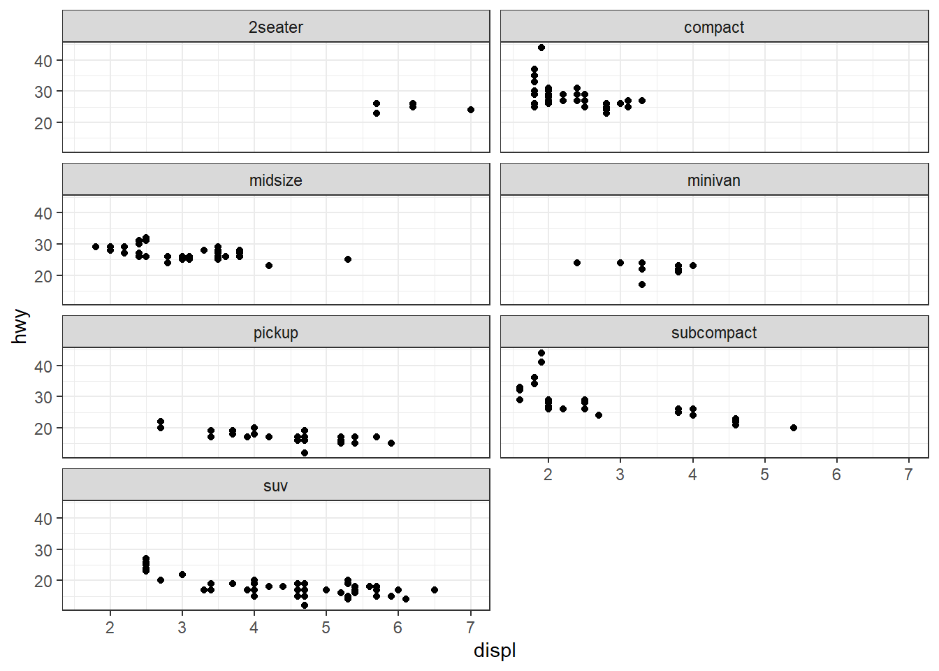
Figure 13.69: Wrapping sub plots in facets
On the other hand, facet_wrap() creates a grid of plots, each showing
a subset of your data based on a single variable. We specify the
variable to use for faceting using the same ~ operator here too. For
example, facet_wrap(~ variable) will create a grid of plots, each
showing a different level of the variable. This is useful when you have
a single categorical variable that you want to use for faceting. See
example in figure 13.70.
ggplot(mpg, aes(x = displ, y = hwy)) +
  geom_point() +
  facet_grid(year ~ class)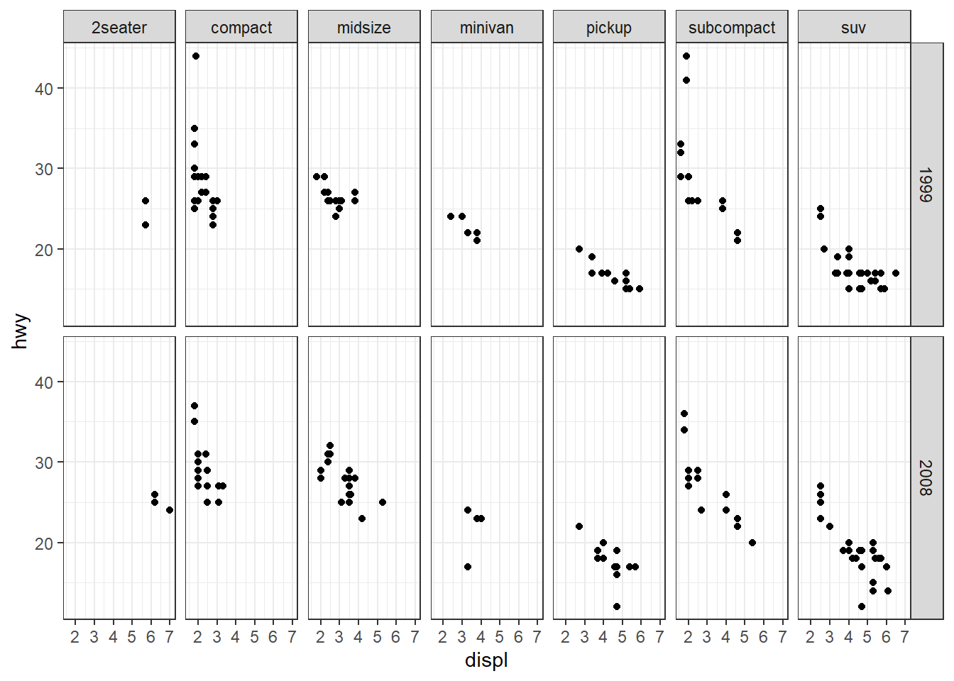
Figure 13.70: Grid alignment of sub plots in facets
13.8 Labeling and Annotating Charts
Labeling is an essential aspect of data visualization because it provides context and information about the data being presented. Labels can include titles, axis labels, legends, and annotations that describe the data and provide important information that helps the viewer understand what they are looking at. Proper labeling can help to make the data more understandable, clear, and accessible, which enhances its overall value and impact.
13.8.1 Annotations
We have already covered use of geoms like geom_text, geom_label, geom_vline, geom_abline, etc., used to label or annotate geometries in a plot. There are several other geoms used to annotate charts in ggplot2. Let us discuss a few of these.
-
geom_rect()is used to draw a rectangle in plot area using aestheticsxmin,xmax,yminandymax -
geom_segment()can create a line segment.
Moreover, there is a helper function annotate which also adds geoms to a plot, but unlike a typical geom function, the properties of the geoms are not mapped from variables of a data frame, but are instead passed in as vectors. This is useful for adding small annotations (such as text labels) or if we have your data in vectors, and for some reason don’t want to put them in a data frame. See an example in plot in Figure 13.71 wherein we have added five annotation elements (i) a rectangle, (ii) two text labels and (iii) two arrows.
ggplot(economics, aes(date, unemploy)) +
  annotate(
    geom = "rect",
    xmin = ymd("20071201"),
    xmax = ymd("20091231"),
    ymin = -Inf,
    ymax = Inf,
    fill = "orange",
    alpha = 0.5
  ) +
  annotate(
    geom = "label",
    x = ymd("20070801"),
    y = 2500,
    label = "Global Financial Crisis",
    hjust = 1
  ) +
  annotate(
    geom = "curve",
    xend = ymd("20080101"),
    yend = 4000,
    x = ymd("20000101"),
    y = 3000,
    curvature = -0.5,
    arrow = arrow(length = unit(0.5, 'cm'))
  ) +
  annotate(
    geom = "text",
    x = ymd("20070801"),
    y = 14000,
    label = "Sharp rise in unemployment",
    hjust = 1,
    fontface = "bold.italic"
  ) +
  annotate(
    geom = "curve",
    xend = ymd("20080701"),
    yend = 12000,
    x = ymd("20000101"),
    y = 13500,
    curvature = 0.5,
    arrow = arrow(length = unit(0.5, 'cm'))
  ) +
  geom_line(color = "indianred4")
Figure 13.71: Annotating charts
13.8.2 Labels
Effective labeling is crucial for ensuring that plots are accessible and comprehensible to a wider audience. To achieve this, it’s important to use full variable names for axis and legend labels, as this enhances clarity. The plot’s title and subtitle should be employed to communicate the primary insights and key takeaways, making the information more digestible at a glance. The caption serves as a valuable space to include details about the data source, providing context and credibility. Furthermore, the tag feature can be utilized to add identification markers, which is particularly helpful when comparing or displaying multiple plots within a project.
There are several ways to add labels to ggplot2 charts, but we will focus on using the labs() function, which allows us to add titles, subtitles, axis labels, and other annotations like caption, etc., to the plot. Example -
ggplot(mtcars, aes(x = hp, y = mpg, color = factor(cyl))) +
  geom_point() +
  labs(title = "Scatter plot of mpg vs. hp",
       subtitle = "Data from mtcars dataset",
       x = "Horsepower",
       y = "Miles per gallon",
       color = "Cylinders",
       caption = "Source: R datasets",
       tag = "Chart-1")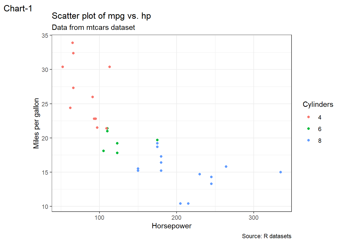
Figure 13.72: A properly labelled chart
13.9 Themes
Till now (except in a few cases) we have used the default themes of plots generated in ggplot2. Themes can be however be used to customise the appearance, visual aesthetics by exercising fine control over the non-data elements in the plot. We can customize the appearance of plots, such as the axis labels, titles, background colors, and font sizes, styles, etc. by applying themes to the plot.
There are certain complete themes available in ggplot2 which set all of the theme elements to values designed to work harmoniously. Defualt theme applied to a plot in ggplot2 is theme_gray(). A complete list of themes available in ggplot2 is given in the table 13.4 below:
| Theme name | Description |
|---|---|
theme_gray() |
The signature ggplot2 theme with a grey background and white gridlines, designed to put the data forward yet make comparisons easy. |
theme_bw() |
The classic dark-on-light ggplot2 theme. May work better for presentations displayed with a projector. |
theme_linedraw() |
A theme with only black lines of various widths on white backgrounds, reminiscent of a line drawing. Serves a purpose similar to theme_bw(). Note that this theme has some very thin lines (\<\< 1 pt) which some journals may refuse. |
theme_light() |
A theme similar to theme_linedraw() but with light grey lines and axes, to direct more attention towards the data. |
theme_dark() |
The dark cousin of theme_light(), with similar line sizes but a dark background. Useful to make thin coloured lines pop out. |
theme_minimal() |
A minimalistic theme with no background annotations. |
theme_classic() |
A classic-looking theme, with x and y axis lines and no gridlines. |
theme_void() |
A completely empty theme. |
theme_test() |
A theme for visual unit tests. It should ideally never change except for new features. |
Example plots having four of such themes can be seen in figure 13.73.
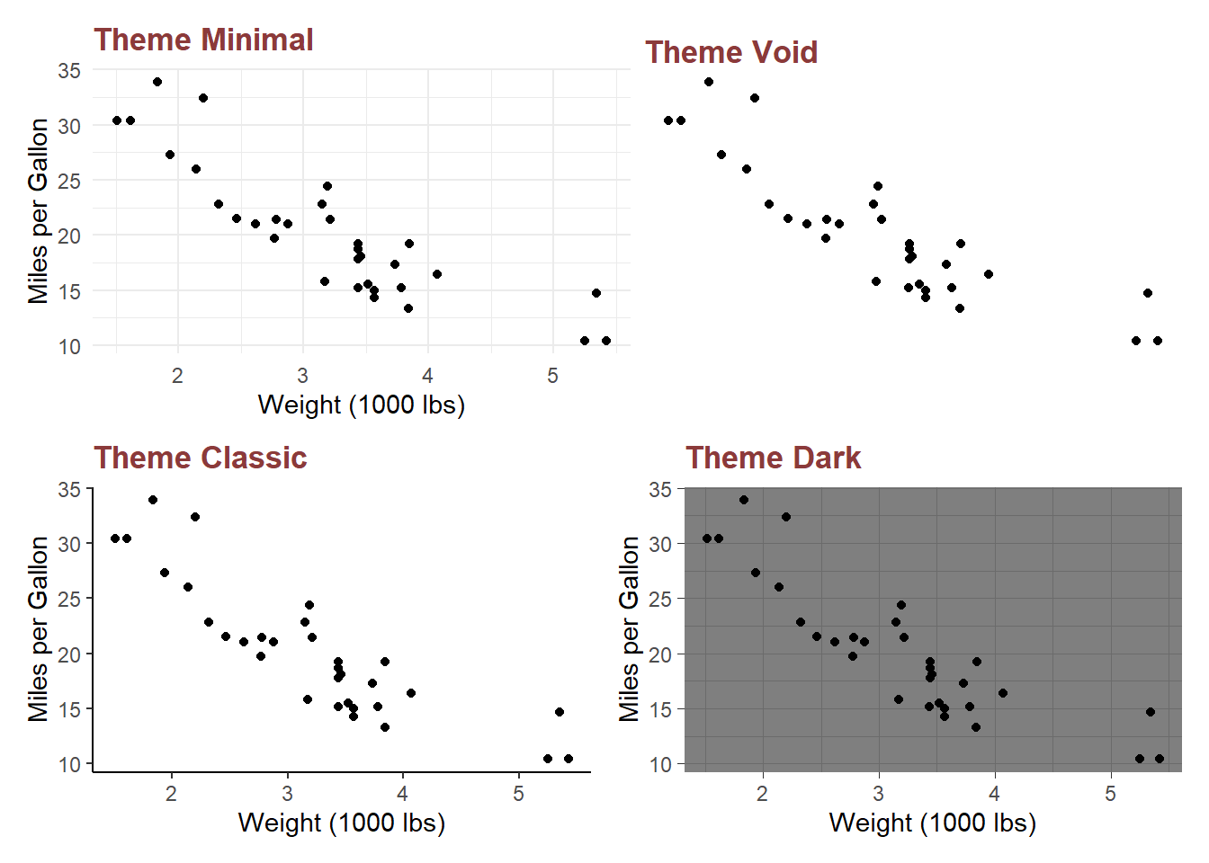
Figure 13.73: Some complete themes available in ggplot2
Individual elements can also, however, be modified through function theme available in ggplot2. This theme function should consist of element name which is to be modified, as an argument to the function. That element can then be modified through providing values to that argument, which most of the times is provided through element function like element_text, etc. Some of the elements commonly requiring a customisation through theme function is explained in figure 13.74.
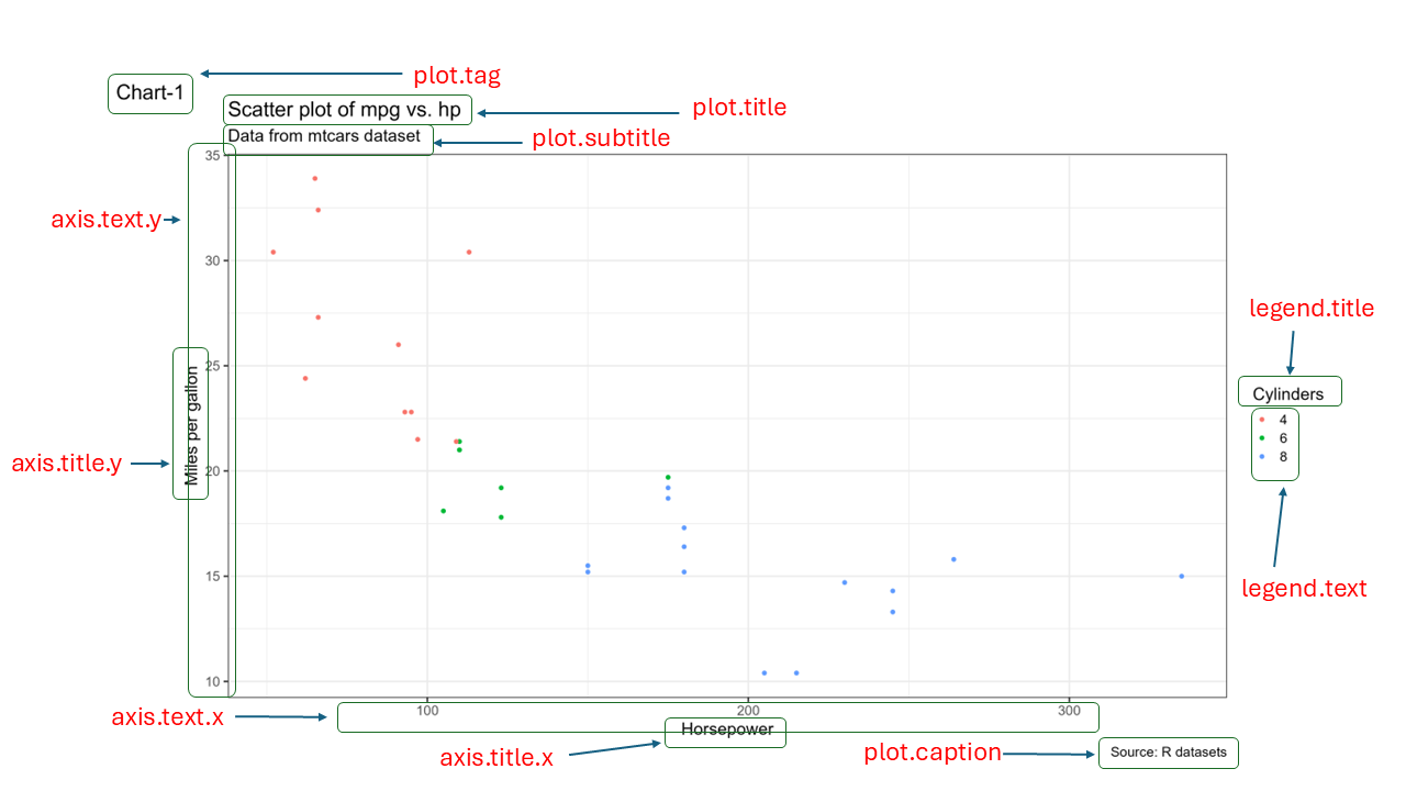
Figure 13.74: Some theme elements
As an example refer plot in figure 13.75 wherein certain plot elements have been modified using theme function.
myplot<- ggplot(mpg, aes(x = cty, y = hwy)) +
  geom_point(size = 2, position = position_jitter(seed = 42), aes(color = factor(class))) +
  geom_point(shape=21, size = 4.5, position = position_jitter(seed = 42), aes(color = factor(class))) +
  geom_smooth(method = "lm", se = FALSE, formula = "y ~ x", linewidth = 0.5) +
  labs(title = "City Vs. Highway Mileages",
       caption = "Data Source: MPG Dataset",
       x = "Mileage in City (Miles per Gallon)",
       y = "Milaege in Highway (Miles per Gallon)",
       color = "Class") +
  theme(
    panel.background = element_rect(fill = NA),
    axis.line = element_line(colour = "seagreen4",
                             linetype = "solid"),
    axis.ticks = element_line(colour = "darkorchid4"),
    axis.text.x = element_text(face = "bold", size = 10),
    axis.text.y = element_text(face = "bold", size = 10),
    axis.title = element_text(face = "bold", size = 12),
    plot.title = element_text(face = "bold", hjust = 0.5, size = 18),
    plot.caption = element_text(face = "italic", size = 12),
    legend.title = element_text(face = "bold.italic", size = 12),
    legend.text = element_text(size = 12),
    legend.position = c(1, 1),
    legend.justification = c(1, 1),
    legend.background = element_rect(size = 1, fill = "white", colour = "grey")
  )

myplot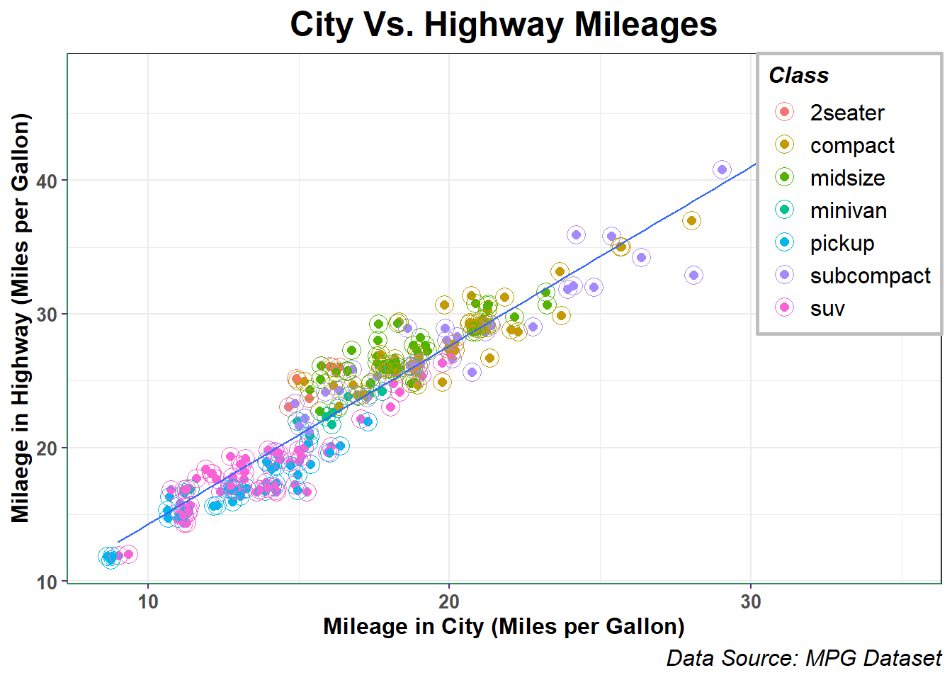
Figure 13.75: Customising Themes in GGplot2
We can combine multiple customization options together to create a customized theme that fits our specific needs using theme_set(). The possibilities for customization are endless, so feel free to experiment and create your own unique theme!
13.10 Saving/exporting plots
Of course, after creating charts/plots we would like to save them for further usage in our reports/documents, etc. Though there may be many options to save a plot to disk, we will be focusing on three different methods.
Saving through Rstudio menu
To save a graph using the RStudio menus, go to the Plots tab and choose Export.

Figure 13.76: Exporting Charts
Three options are available here.
- Save as Image
- Save as PDF
- Copy to clipboard.
We can use the options as per requirement.
Saving through code
We may also save our plots using function ggsave() here. Its syntax is simple
ggsave(
  filename,
  plot = last_plot(),
  device = NULL,
  path = NULL,
  scale = 1,
  width = NA,
  height = NA,
  units = c("in", "cm", "mm", "px"),
  dpi = 300,
  limitsize = TRUE,
  bg = NULL,
  ...
)
All arguments are simple to understand. Thus for example if we need to save the plot we generated in figure 13.75, we can use ggsave.
ggsave('Mileages.png', myplot, height = 10, width = 8)Graphics Devices (Base R Plots)
If we have created plots outside of ggplot (with plot(), hist(),
boxplot(), etc.), we cannot use ggsave() to save our plots since it
only supports plots made with ggplot.
Base R provides a way to save these plots with its graphic device functions. There are three steps involved in this process-
- Specify the file extension and properties (size, resolution, etc.) along with units
- create the plot, in base R or/and ggplot2
- Signal that the plot is finished and save it by running
dev.off(). Thus, using this way we can insert as many charts in a single pdf without turning off the device till our pdf is ready.
Example-
# Creates a png file
png(
  filename = "scatter.png",
  width = 5,
  height = 3,
  units = "in",
  res = 300
)
# Prints a ggplot2 in it
ggplot(mtcars, aes(x = wt, y = mpg)) +
  geom_point() +
  geom_abline(intercept = 5,
              slope = 3,
              color = "seagreen")
# Device is off
dev.off()
## png
## 2
# Creates a new PDF file
pdf(file = "two_page.pdf",
    width = 6,
    height = 4)
#first plot
plot(mtcars$wt, mtcars$mpg)
abline(a = 5, b = 3, col = "red")
# Second Plot
ggplot(mtcars, aes(x = wt, y = mpg)) +
  geom_point() +
  geom_abline(intercept = 5,
              slope = 3,
              color = "seagreen")
# Device Off
dev.off()
## png
## 2